What’s New in R: December 8, 2025
Welcome to this week’s edition of What’s New in R! This week, we’re featuring the complete collection of posit::conf(2025) talks, a keynote from posit::conf on trustworthy data visualization, and a tutorial on creating interactive {ggplot2} visualizations. Let’s dive in!
posit::conf(2025) Talks
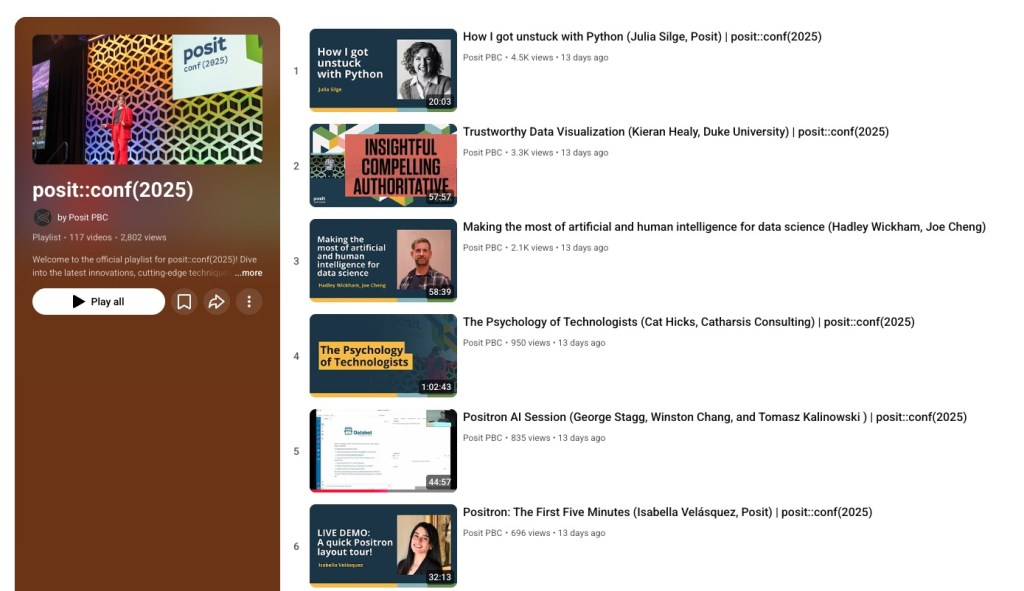
Posit has released over 100 talks from posit::conf(2025), covering everything from R and Python development to AI integration, data visualization, and production workflows. With topics ranging from package development and Quarto publishing to Shiny applications and spatial analysis, there’s truly something for everyone. Whether you’re interested in learning about Positron, exploring new visualization techniques, or discovering best practices for production data science, this comprehensive playlist offers hours and hours of content from practitioners sharing real-world solutions.
Trustworthy Data Visualization
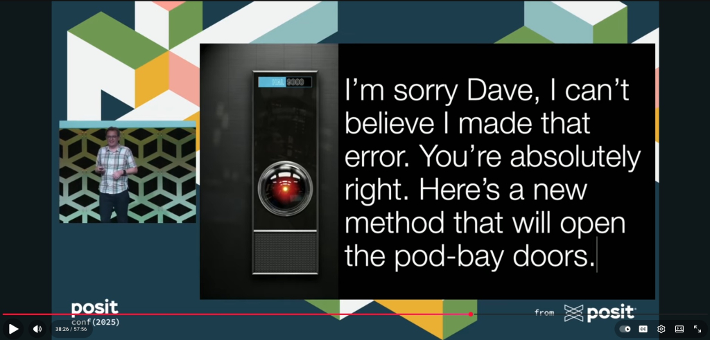
Kieran Healy of Duke University delivers a thought-provoking closing keynote from posit::conf(2025) examining what makes data visualizations trustworthy. While R and {ggplot2} provide powerful tools for creating compelling graphics, Healy argues that trustworthiness depends less on technical sophistication and more on a web of social processes and individual commitments that cannot be easily automated. The talk offers important perspective on data visualization in an era of AI-generated content, data manipulation, and eroding institutional trust.
Convierte gráficos {ggplot2} en visualizaciones interactivas con {ggiraph}
Bastián Olea Herrera provides a comprehensive tutorial (in Spanish) on using the {ggiraph} package to add interactivity to {ggplot2} graphics. Unlike alternatives like {plotly}, {ggiraph} maintains 100% of your original {ggplot2} appearance while adding features like tooltips, hover effects, and click interactions. The post walks through practical examples of creating interactive scatter plots and demonstrates how to link multiple visualizations so interactions in one plot affect others — all while staying within the familiar {ggplot2} workflow.
If you enjoyed this issue of What’s New In R, please share it with a friend! And if they want to get What’s New in R directly in their inbox, they can sign up on the R for the Rest of Us website.
Got any ideas for resources I should feature in future issues of What’s New in R? Leave a comment below!
Sign up for the newsletter
Get blog posts like this delivered straight to your inbox.

You need to be signed-in to comment on this post. Login.