What’s New in R: January 26, 2026
Welcome to this week’s edition of What’s New in R! This week, we’re featuring a geospatial analysis of Barcelona’s nightlife scene, a demonstration of AI-assisted data exploration in Positron, and a comprehensive guide to data visualization best practices. Let’s dive in!
Nightlife of Barcelona Neighborhoods
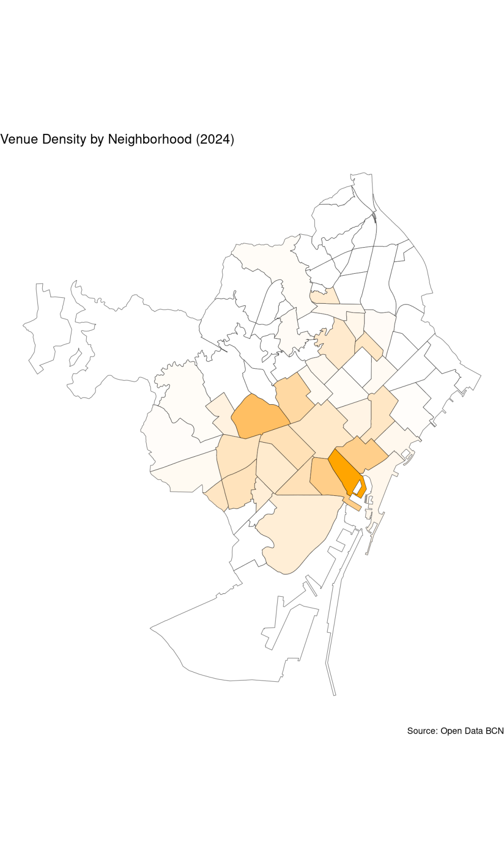
Jose M Sallan conducts a neighborhood-level analysis of Barcelona’s nightlife using geospatial data and the {sf} package. The post demonstrates how to work with spatial data, including performing spatial joins to correctly assign venues to neighborhoods and creating choropleth maps to visualize both the total number of nightlife venues and venue density across the city. Sallan’s analysis reveals two distinct geographical zones — the upscale Sant Gervasi-Galvany neighborhood and the tourism-driven downtown areas like Barri Gòtic and El Raval— each with their own unique nightlife character. It’s a practical example of using spatial analysis tools in R to explore urban data.
Analyzing my music listening data with Databot
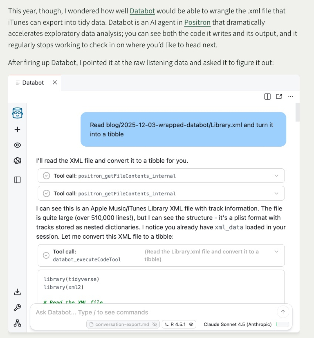
Simon Couch demonstrates how to use Databot, Positron’s AI agent for exploratory data analysis, to analyze his Apple Music listening history. Rather than manually wrangling the complex XML file format that iTunes exports, Couch lets Databot figure out how to parse the data and generate insights. Within minutes, the AI agent successfully converted the 500,000+ line XML file into a tidy tibble and produced his personal “Spotify Wrapped” style analysis, identifying his most-played songs, artists, and albums. The post includes the full transcript of his conversation with Databot, offering a transparent look at how this experimental tool can accelerate the exploratory phase of data analysis.
Saloni’s guide to data visualization
Saloni Dattani of Our World in Data provides a comprehensive guide to creating effective data visualizations. While not R-specific, the principles apply directly to work in {ggplot2} and other R visualization tools. Dattani covers why visualization matters, how to choose meaningful chart types, techniques for making charts clearer (like using horizontal text and direct labeling), and how to avoid common pitfalls like misleading scales and confusing color choices. The guide emphasizes creating charts that work as standalone pieces, are accessible to colorblind viewers, and include proper context and sourcing. Whether you’re creating exploratory visualizations or polished final graphics, this guide offers valuable insights for improving your data visualization work.
If you enjoyed this issue of What’s New In R, please share it with a friend! And if they want to get What’s New in R directly in their inbox, they can sign up on the R for the Rest of Us website.
Got any ideas for resources I should feature in future issues of What’s New in R? Leave a comment below!
Sign up for the newsletter
Get blog posts like this delivered straight to your inbox.

You need to be signed-in to comment on this post. Login.