What’s New in R: February 2, 2026
Welcome to this week’s edition of What’s New in R! This week, we’re featuring a creative approach to chart styling using ImageMagick, a tutorial on recreating Datawrapper visualizations with {ggplot2}, and a package for creating on-brand Word and PowerPoint documents. Let’s dive in!
Creating Embroidered Charts with R and ImageMagick
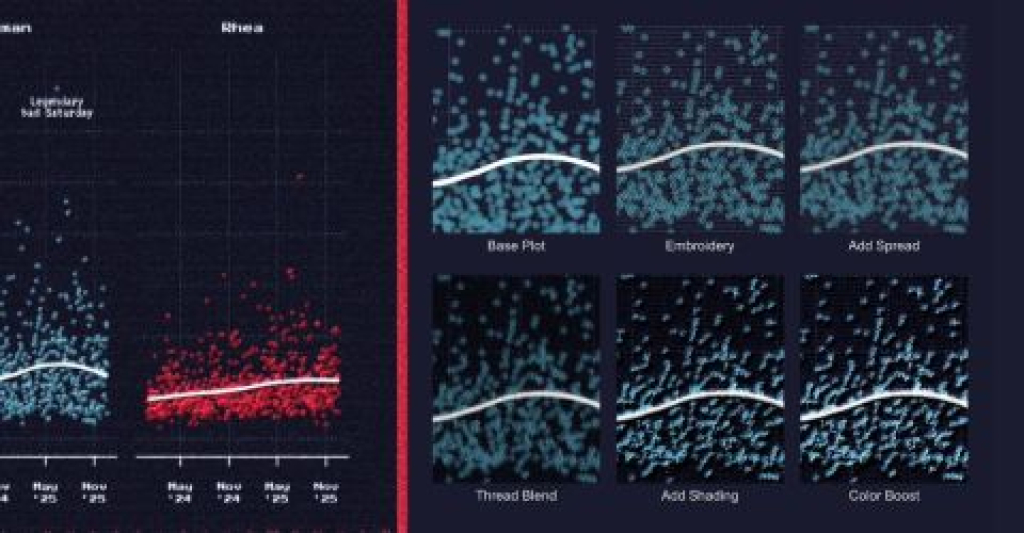
Aman Bhargava demonstrates how to create charts that look like they’ve been embroidered onto cloth by combining {ggplot2} with ImageMagick filters. Using the {magick} package to apply programmatic image manipulation, Bhargava walks through adding texture, depth, and a handcrafted aesthetic to digital charts through techniques like pixel spreading, noise blending, and shade mapping. The approach is entirely reproducible: when your data changes, you simply re-run the script rather than manually applying filters in Photoshop. While this might seem like a purely artistic exercise, it demonstrates how understanding image editing principles can translate into automated, code-based workflows for creating unique data visualizations.
Learning data viz from the best: New America and Datawrapper
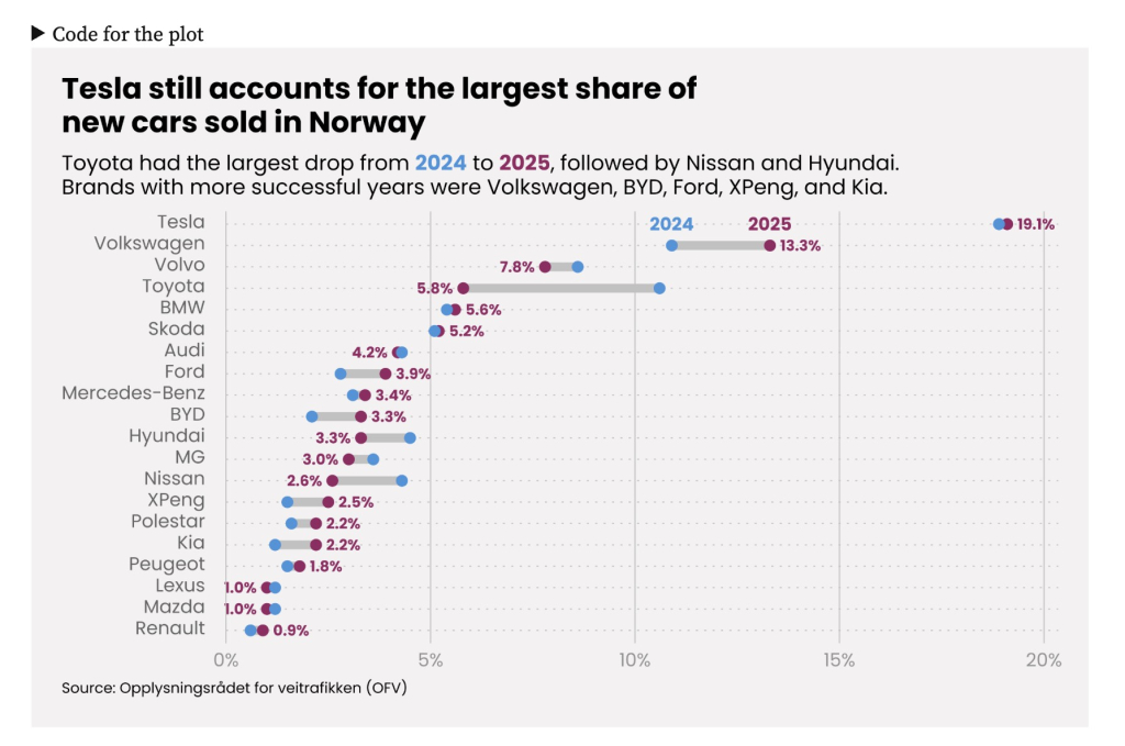
Daniel Roelfs recreates elegant data visualizations from a New America report using {ggplot2}, demonstrating that the polished look of Datawrapper charts can be achieved with R. The post methodically breaks down design elements — from placing axis labels inside the plot area to using direct labeling instead of legends — and shows how to implement them. Roelfs covers multiple chart types including scatter plots, stacked bar charts, line plots, and range plots, providing detailed code for each. The tutorial emphasizes how attention to small details like typography, spacing, and color choices can dramatically improve the professional appearance of your visualizations. It’s an excellent resource for learning both {ggplot2} techniques and data visualization best practices.
{onbrand}
The {onbrand} package, developed by John Harrold and Bryan Smith, provides a solution for creating branded Word and PowerPoint documents in R. Built on top of the {officer} package, {onbrand} creates an abstraction layer that maps template-specific details to human-readable names. This means you can write reporting code once and easily switch between different organizational templates without changing your code—you simply update the template-specific YAML file. The package includes vignettes on creating custom Office templates and building templated reporting workflows, making it easier to maintain consistent branding across reports while keeping your code flexible and reusable.
If you enjoyed this issue of What’s New In R, please share it with a friend! And if they want to get What’s New in R directly in their inbox, they can sign up on the R for the Rest of Us website.
Got any ideas for resources I should feature in future issues of What’s New in R? Leave a comment below!
Sign up for the newsletter
Get blog posts like this delivered straight to your inbox.

You need to be signed-in to comment on this post. Login.