
What’s New in R: March 9, 2026
Welcome to this week’s edition of What’s New in R! This week, we’re featuring a major new release of {dplyr}, a package for turning Shiny apps into AI chat interfaces, and a tutorial on mapping building use with hexagonal grids. Let’s dive in!
dplyr 1.2.0
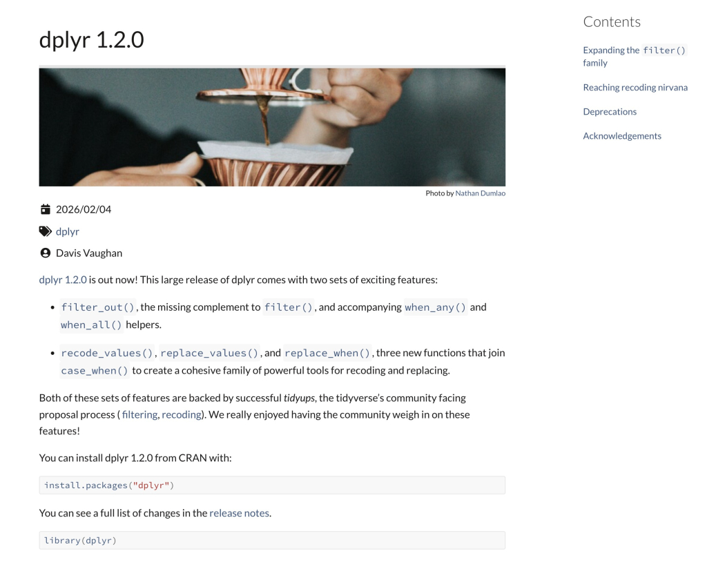
Davis Vaughan announces {dplyr} 1.2.0, a major release with two big sets of new features. First, the new filter_out() function fills a long-standing gap by providing a complement to filter()—it drops rows rather than keeps them, and its NA handling works with you rather than against you, eliminating the need for confusing ! and !is.na() gymnastics. New helpers when_any() and when_all() also make it easier to combine filter conditions with | instead of &. Second, the release introduces a cohesive family of recoding and replacing functions—recode_values(), replace_values(), and replace_when()—which join the existing case_when() to make value transformation more expressive and readable, including support for lookup tables stored in external CSV files. If you use {dplyr} regularly (and many, many R users do), this is a release worth digging into.
{shinymcp}
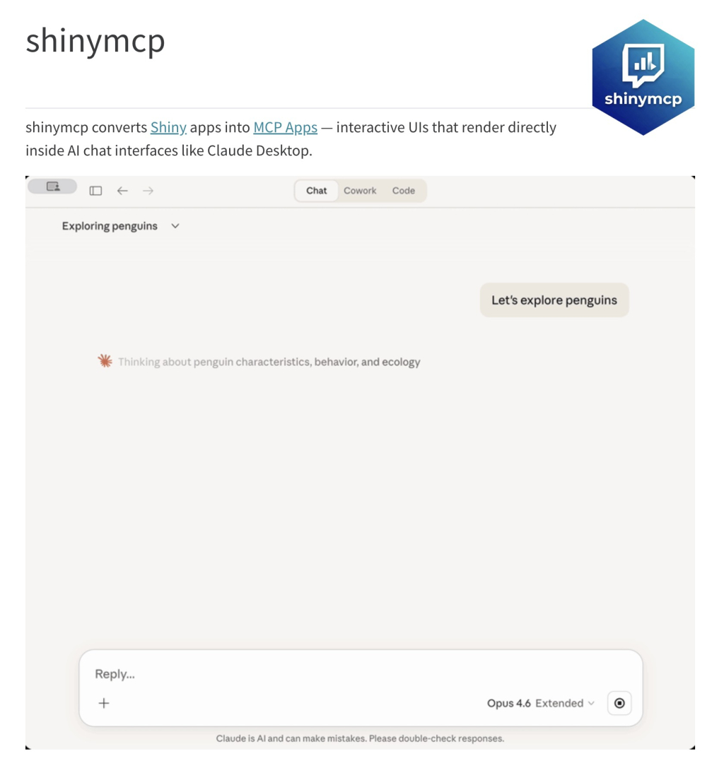
James Wade introduces {shinymcp}, a package that converts Shiny apps into MCP Apps—interactive user interfaces that render directly inside AI chat interfaces like Claude Desktop. Rather than opening a separate browser window, users can interact with dropdowns, sliders, and other inputs while staying in their chat conversation, with outputs like plots, tables, and text updating inline. The package includes both a manual conversion workflow and an automatic parse-analyze-generate pipeline that can scaffold an MCP App from an existing Shiny app. It’s a fascinating look at how Shiny’s reactive paradigm can be adapted to work with the new wave of AI-native interfaces.
Mapping building use with a hexagonal grid
Dominic Royé demonstrates how to aggregate building-use raster data across Spain onto a 20 km hexagonal grid and visualize the mix of agricultural, industrial, and commercial activity using proportional symbols. Using {sf}’s st_make_grid() with square = FALSE, the tutorial walks through creating the hex grid, extracting and summarizing raster values per cell, and plotting overlapping proportional circles with multiply blending via the {ggblend} package—so that areas with mixed land use show combined colors. The post also covers including the Canary Islands as an inset with {patchwork} and building an additive color legend. It’s an impressive showcase of how hexagonal grids can reduce directional bias and improve the readability of spatial patterns compared to traditional choropleth maps.
If you enjoyed this issue of What’s New In R, please share it with a friend! And if they want to get What’s New in R directly in their inbox, they can sign up on the R for the Rest of Us website.
Got any ideas for resources I should feature in future issues of What’s New in R? Leave a comment below!
Sign up for the newsletter
Get blog posts like this delivered straight to your inbox.

You need to be signed-in to comment on this post. Login.