
What’s New in R: April 27, 2026
Welcome to this week’s edition of What’s New in R! This week, we’re featuring a comprehensive guide to making beautiful tables with {gt}, a tutorial on interactive beeswarm charts, and a look at how one R user is building a data infrastructure for Kenyan baseball. Let’s dive in!
Creating Effective Display Tables with the gt Package
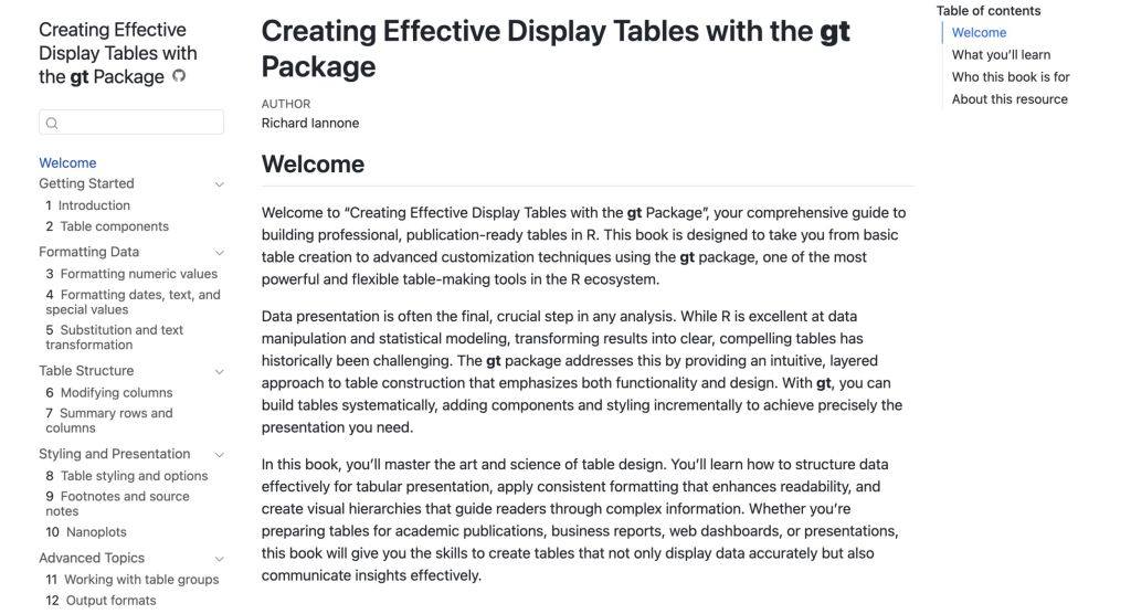
Richard Iannone, the creator of {gt}, has published an online book that serves as the definitive guide to building publication-ready tables in R. It covers everything from understanding table anatomy and formatting numbers, dates, and currencies, to applying visual styling with colors, borders, and fonts, adding footnotes and conditional formatting, and incorporating sparklines and custom themes. The book also addresses how to tailor tables for different output formats, including HTML, PDF, and Word. Whether you’re producing tables for reports, dashboards, or academic papers, this is the resource to bookmark.
Interactive beeswarm charts in R
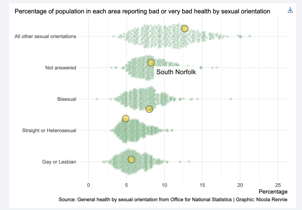
Nicola Rennie walks through how to combine the {ggbeeswarm} and {ggiraph} packages to create interactive beeswarm charts in R. Beeswarm charts show individual data points without overlap, making them great for visualizing distributions—but since {ggiraph} doesn’t have a native beeswarm geom, Rennie demonstrates a clever workaround: borrow the layout from {ggbeeswarm} and substitute geom_point_interactive() in its place. The result is a chart where hovering reveals tooltips tied to each data point, and coordinated views let you compare distributions across multiple categories at once. It’s a great example of how combining two focused packages can unlock something neither offers on its own.
Architecting a Data-Driven Meritocracy for Kenyan Baseball
Keith Karani, founder of Diamond Digest Labs, writes about building Basepoint, a data platform designed to close what he calls the “Visibility Gap” in sports analytics for emerging markets. In Kenya, valuable baseball performance data exists but sits fragmented across local spreadsheets and individual team devices, invisible to scouts and the wider world. Basepoint addresses this by migrating those raw, scattered statistics into a centralized, cloud-native database connected via Positron, turning hidden local data into a verified, scout-ready digital CV for Kenyan players. It’s an ambitious project that shows how R and modern data tooling can give a sport—and its athletes—the global visibility they deserve.
If you enjoyed this issue of What’s New In R, please share it with a friend! And if they want to get What’s New in R directly in their inbox, they can sign up on the R for the Rest of Us website.
Got any ideas for resources I should feature in future issues of What’s New in R? Leave a comment below!
Sign up for the newsletter
Get blog posts like this delivered straight to your inbox.

You need to be signed-in to comment on this post. Login.