
Resources
This carefully curated collection of resources will help you find packages and learning resources to help you on your R journey.
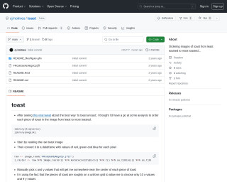
Ordering images of toast from least toasted to most toasted...
The GitHub repository 'toast' by cj-holmes is a unique project that involves organizing images of toast based on their level of toasting, from least to most toasted. It provides an analytical approach to the humorous question of the best way to 'toast a toast' using R and ImageMagick. The repository includes code to read and analyze an image of toast, select pixel values, and visualize them to identify the level of toasting. It leverages packages from the tidyverse and uses ggplot for visualization and magick for image processing to create a greyscale intensity from RGB values of pixels.
Go to Resource
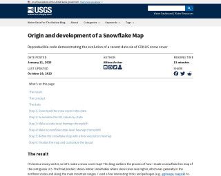
Origin and development of a Snowflake Map
This blog post describes the origin and development of a snowflake map, a data visualization technique for representing snow cover. The author explains the concept, the data used, and the steps involved in creating the map. The post also mentions the use of various packages like ggimage and magick. The final result is a snowflake hex map of the contiguous U.S. that shows average snow cover.
Go to Resource
Outliers in Data Analysis: Detecting Extreme Values Before Modeling in R
This content provides a comprehensive guide on detecting outliers in data analysis before modeling using R, with a specific focus on Airbnb listings data from Istanbul. It emphasizes the importance of understanding the statistical implications of outliers and how they can distort statistical analysis and modeling efforts. The guide demonstrates practical outlier detection methods and includes R code for loading and pre-processing the Airbnb dataset, while also discussing relevant statistical concepts and the importance of making informed preprocessing decisions. Example variables such as price, minimum_nights, and room_type are used for illustration.
Go to Resource
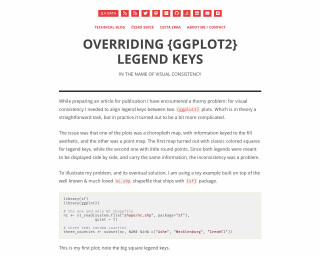
Overriding {ggplot2} Legend Keys · Jindra Lacko
This content describes a method to achieve visual consistency in {ggplot2} legends across different plot types by overriding the legend keys. Specifically, it addresses aligning legend keys between a choropleth map and a point map in R, with the choropleth map using square keys and the point map using round points. The article provides an example using North Carolina shapefiles and demonstrates how to use the key_glyph argument in geom_sf() to customize legend glyphs, thereby maintaining a consistent legend appearance across multiple plots. It also explores alternative glyphs like timeseries and boxplot in the context of maps.
Go to Resource
Parameterized Reporting with RMarkdown
Parameterized Reporting with RMarkdown is a tutorial that explains how to use parameterized reporting in RMarkdown to generate multiple reports at the same time.
Go to Resource
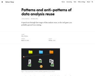
Patterns and anti-patterns of data analysis reuse
The blog post titled 'Before I Sleep: Patterns and anti-patterns of data analysis reuse' by Miles McBain discusses the common themes in data analysis roles pertaining to the repeated nature of certain analyses across various industries. McBain highlights the need for reusing code and strategies efficiently to maintain productivity amidst this recurring challenge. The text delves into different stages of data analysis reuse, such as copy-pasting previous work, which may initially save time but lead to accruing technical debt. It stresses on setting up practices for swift reuse of work to build upon proven capabilities, assuming the work is code-based and document-like products are code-generated.
Go to Resource
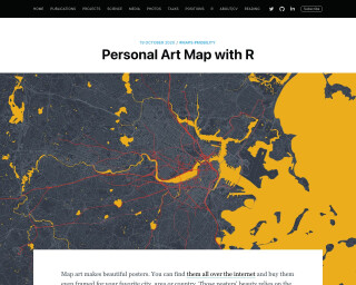
Personal Art Map with R
Learn how to create personal art maps with R using data from Open Street Maps (OSM) and personal mobility data. This tutorial provides step-by-step instructions on downloading street maps, collecting highway and street data, and combining them to create personalized maps.
Go to Resource
PIPING HOT DATA: Getting started with unit testing in R
Getting started with unit testing in R. This blog post accompanies the R-Ladies Philly workshop on Nov 11, 2021, where they demonstrate how to automate R package testing using the usethis, devtools, testthat, and covr packages. The post highlights key points from the workshop, including strategies for writing tests, debugging techniques, and concepts in function writing that facilitate the testing process.
Go to Resource
PIPING HOT DATA: GGanimating a geographic introduction
GGanimating a geographic introduction using gganimate and ggtext
Go to Resource
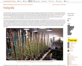
Pivoting tidily
This post discusses the new pivot_longer() and pivot_wider() functions from the tidyr package in R. It demonstrates how these functions can facilitate common data processing steps and reduce the need for extensive data wrangling. The post uses an example from a Plant Physiology Lab course to illustrate the use of these functions.
Go to Resource

Plotting Age Pyramids with ggplot
Jose M Sallan's blog post titled 'Plotting Age Pyramids with ggplot' outlines the process of creating age pyramids using R and ggplot2. Age pyramids display population distributions by age groups and sex, typically with males on the left and females on the right. The article guides readers through formatting and adjusting data using tidyverse functions, and demonstrates how to plot these pyramids by reading data from a CSV file, cleaning column names, filtering, selecting, and mutating data to reflect proper age groups and percentages. This tutorial caters to those interested in data visualization and demographic analysis.
Go to Resource