
Resources
This carefully curated collection of resources will help you find packages and learning resources to help you on your R journey.
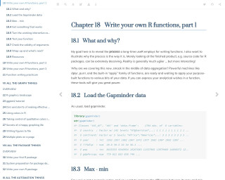
Stat545: Chapters 18-20: Write your own functions
Chapter 18 Write your own R functions, part 1
Go to Resource
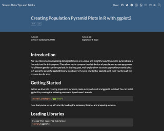
Steve’s Data Tips and Tricks - Creating Population Pyramid Plots in R with ggplot2
Learn how to create population pyramid plots in R using ggplot2. This tutorial provides step-by-step instructions and sample code.
Go to Resource
Stop making messy line charts and create meaningful plots instead
Stop making messy line charts and create meaningful plots instead
Go to Resource
STOP Wasting Space on HUGE LEGENDS | A ggplot2 step-by-step guide - YouTube
A step-by-step guide on how to create more compact legends in ggplot2.
Go to Resource
Take A Sad Plot & Make It Better: A Case Study with R and ggplot2
A case study with R and ggplot2 on improving a sad plot
Go to Resource
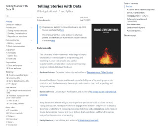
Telling Stories with Data
Telling Stories with Data by Rohan Alexander is a comprehensive guide on communicating insights effectively using data in R and Python. Published by Chapman and Hall/CRC, the book is endorsed by experts for its unique approach in emphasizing statistical communication, programming, and modeling. It covers the entire data science workflow, including data acquisition, analysis, and reproducibility, making it an excellent resource for statistics courses or self-learning. It focuses on developing the computational and philosophical skills necessary for sense-making and telling stories with data, making it a valuable tool for data scientists and analysts.
Go to Resource
Ten great R functions #3
Erik Gahner Larsen's blog post shares another ten essential R functions to aid users with different tasks in 2024, some new and some old. The post includes functions like reprex::reprex() for creating reproducible examples, data.table::let() for easier data manipulation, renv::init() for reproducible environments, and directlabels::geom_dl() for enhanced data visualizations. These functions cater to a variety of needs from efficient data frame manipulation to ensuring reproducibility, and from enhancing visual outputs to managing project environments effectively.
Go to Resource
The best R packages for data visualization
The best R packages for data visualization provide a comprehensive suite of tools for creating all types of charts and graphs. Core to R's visualization capabilities is the package ggplot2, which offers a versatile grammar of graphics. Extensions of ggplot2 and other packages expand these functionalities, allowing for interactive charts, improved aesthetics, specialized geospatial analysis, and managing complex data structures like networks. Packages like plotly, rmarkdown, patchwork, and hrbrthemes enhance the user experience and presentation. Additionally, there are packages dedicated to managing colors, creating tables, and supporting specific chart types like word clouds and streamgraphs.
Go to Resource
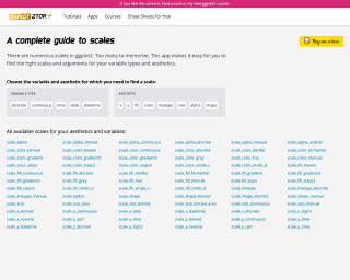
The ggplot flipbook
The ggplot flipbook is a book made with xaringan that introduces the ggplot2 package in R. It explains the concept of the layered grammar of graphics and demonstrates a 'slow ggplotting' method for building plots incrementally. The book provides examples and code snippets to help users learn how to use ggplot2 effectively for data visualization.
Go to Resource
The ggplot2 package popularity index
This article by Erik Gahner Larsen discusses the popularity of ggplot2 package extensions. He explores the ecosystem of packages that enhance ggplot2 capabilities, from new geometric objects to custom color themes. Despite the existence of official galleries and other resources, Larsen presents his own criteria for ranking the popularity of ggplot2 packages, emphasizing CRAN downloads and adherence to the grammar of graphics principles. He critiques existing rankings for including outdated or non-CRAN packages and introduces his strict definition of what constitutes a ggplot2 extension, focusing on low-level functions that directly improve ggplot2 objects.
Go to Resource
The Glamour of Graphics
In this talk, William Chase presents design principles that can be applied to transform any chart from drab to fab. He focuses on the 'Glamour of Graphics' and how it can be implemented in ggplot to improve the visual appeal and persuasive power of charts.
Go to Resource