
Resources
This carefully curated collection of resources will help you find packages and learning resources to help you on your R journey.
Tidy Tuesday live screencast: Analyzing global crop yields in R
A live screencast of a Tidy Tuesday session where global crop yields are analyzed using R.
Go to Resource

TidyTuesday: Racial disparities in reproductive research
This TidyTuesday project investigates racial and ethnic disparities in reproductive medicine in the United States, as presented in a narrative review from a January 2025 issue of the American Journal of Obstetrics and Gynecology. The dataset consists of studies from top peer-reviewed Ob/Gyn journals between 2010 and 2023, aiming to explore differences in racial group representations across study types and examine changes in representation over time. The project involves data cleaning, analysis, and visualization using R packages like tidytuesdayR, tidyverse, and ggplot2, with an intent to identify trends and recommend informed strategies for future research in obstetrics and gynecology.
Go to Resource
Time-aware isochrones for accessibility mapping with R and Mapbox tools
This article discusses creating time-aware isochrones to analyze accessibility at different times of the day using R and Mapbox tools. It demonstrates how to work with traffic data and visualize the impact of traffic using Mapbox's predicted traffic data. The tutorial includes step-by-step instructions and code snippets for generating isochrones for specific addresses at different times, and visualizing them interactively on a map with a comparison slider to highlight the accessibility differences at noon versus rush hour. The tools discussed are the R packages mapboxapi and mapgl.
Go to Resource
Tips for debugging and cleaning broken code
This guide provides strategies for debugging and cleaning broken R code, specifically in a data visualization context using 'dplyr' and 'ggplot2'. It helps identify common mistakes in function chaining and plot layering, offering tips on how to spot and fix errors such as misspelled words or misplaced punctuation. The article illustrates the debugging process using an example with incorrect R code, followed by the corrected version. The guide emphasizes the importance of code formatting and reindenting for troubleshooting, making the debugging process less daunting.
Go to Resource
tmap vs. ggplot2 for mapping
This content provides insights into the author's experience updating R code snippets for the Computing Geographically website, with a focus on transitioning from tmap version 3 to version 4, alongside adopting ggplot2 for everyday mapping tasks. It compares the two packages, tmap and ggplot2, which both utilize a grammar of graphics approach but serve different purposes. The author discusses the advantages of using tmap, a package specifically designed for mapping, over ggplot2, a general-purpose visualization tool, with examples such as choropleth maps and raster data handling. The post also warns about potential issues with backward compatibility in both packages and showcases code examples.
Go to Resource
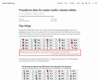
Transform data for easier multi-column tables
Andrew Weatherman's tutorial provides a step by step guide on transforming data into a wide format to facilitate the creation of intuitive multi-column tables in R using the gt package. It shows how to apply a "538-style" caption to add visual clarity to average team performance statistics against top 100 opponents in men's college basketball over the past five seasons. The tutorial includes detailed explanation of the data manipulation process and the R code needed to produce a visually appealing and informative table.
Go to Resource
Trying out dplyr 1.2.0
Crystal Lewis experiments with the new dplyr 1.2.0 features in her article, demonstrating the improved filtering and recoding functions. The Posit team's latest update to this essential R package simplifies data cleaning processes with functions like filter_out(), recode_values(), replace_values(), and replace_when(). With practical examples, Lewis showcases the enhancements and provides a smooth introduction to these changes, making data wrangling more intuitive in R.
Go to Resource
TSA Screening Volume and Epiweeks
This content showcases a visualization of TSA screening volumes compared to Subway ridership, particularly amidst the pandemic's impact. It involves data aggregation challenges, like determining weekly counts from daily data, which can be skewed at year's end. The author addresses these issues using R code and TSA data available since January 2019, presenting a more detailed view of travel patterns over time and emphasizing the importance of careful handling of time-series data when aggregating by weeks, using ISO-8601 date format for this purpose.
Go to Resource
Understanding the Rise in Domestic Terrorism: Context Matters
Steven Ponce's analytical dashboard examines the increase in US domestic terrorism incidents from 1994-2024, adjusting for population growth. Utilizing raw attack counts and US Census Bureau data, the dashboard presents a four-panel visualization showcasing the adjusted per capita rates and trends by ideology. While the raw attack counts increased by 53%, after adjustment, a 26% rise in per capita rates is observed, highlighting the significant but less dramatic increase. Right-wing attacks have been dominant throughout, with an emphasis on the more modest rise when considering population growth. Released on November 19, 2025, this analysis emphasizes context in understanding domestic terrorism trends.
Go to Resource
UNHCR Dataviz Platform - Aim of better data storytelling
The UNHCR Data Visualization Platform provides insights, guidelines, and tools designed to improve data storytelling. With a vast chart gallery, users can select charts to effectively showcase data and highlight specific attributes and relationships. The UNHCR Data Visualization Guidelines offer clear, brand-compliant advice for professional graphics. The platform supplies various tools, templates, and scripts compatible with Excel, Power BI, Adobe Illustrator, R, Python, D3, and GIS, aiding in the creation of high-quality visualizations. Additionally, a collection of storymaps, dashboards, and infographics serves as inspiration for crafting compelling data narratives.
Go to Resource
Use dumbbell plots instead of paired bar charts in 130 seconds - YouTube
This YouTube video discusses the use of dumbbell plots as an alternative to paired bar charts.
Go to Resource