
Resources
This carefully curated collection of resources will help you find packages and learning resources to help you on your R journey.
Use meta shortcode variables with Quarto Includes to insert precise content - Posit
This blog post by Ashley Henry at Posit discusses how to use meta shortcode variables with Quarto Includes to ensure precise content insertion in your documentation. It delves into the benefits of using Quarto, a system for technical writing that enhances the insertion process by allowing for better customization and modularity. The post is targeted at users who are involved in the documentation process and are looking for methods to optimize content consistency while maintaining flexibility. Ashley Henry also shares her expertise from her time in the Navy and at Posit, where she focuses on clear and effective documentation.
Go to Resource
Use of flextable – Notes from a data witch
This content intertwines a tutorial on using the flextable package in R with personal reflections on the book 'Use of Weapons' by Iain Banks. It starts with a nostalgic recollection from the author's past, and leads into an exploration of crafting tables in R. The post integrates a fondness for the Culture novels by Banks, touching upon aspects of storytelling within a technical guide. The aim is to show how the flextable package enhances data representation, paralleling the way stories weave narratives, thereby making data more approachable and engaging, just like a good science fiction universe.
Go to Resource
Using {ellmer} for Dynamic Alt Text Generation in {shiny} Apps
This article describes how to use the {ellmer} package to automate the creation of alternative text (alt text) for images in {shiny} applications, with an emphasis on accessibility for screen readers. It addresses the challenges of generating dynamic alt text for interactive ggplot2 charts within {shiny} apps and introduces the reader to the package functions and error handling for robust application development. Practical examples with ggplot2 and the integration with large language models for descriptive text generation are also included, alongside tips for writing effective alt text.
Go to Resource
Using project scripts to keep Quarto source and output files organised
Pete Jones provides a tip for managing Quarto projects where the user wants to separate source (.qmd files) and output (.pdf, .html, etc.) files, especially when source files are in a subdirectory. The article addresses the problem that arises when Quarto's default settings place rendered output next to source files, which can create organizational issues in projects. The article intends to show how to overcome this by leveraging Quarto's features to keep files neatly organized within project subdirectories.
Go to Resource
Using project scripts to keep Quarto source and output files organised
Pete Jones shares a tip for organizing Quarto project files, focusing on separating source (.qmd) and output (.pdf, .html) files when source files are stored in subdirectories. This is a particular challenge due to Quarto's default behavior of placing output files next to their source. The article discusses project-based workflows, the issues with Quarto subdirectories, and leverages Quarto features to solve the problem. A scripted solution is presented to ensure outputs are organized in a specified directory, maintaining a clean project structure even with source files in subdirectories.
Go to Resource
Using Quarto to Write a Book
Kieran Healy discusses revising his Data Visualization book using Quarto, a publishing system optimized for plain-text format and integrates code snippets in documents. The book focuses on data visualization with R and ggplot, detailing advantages and constraints of Quarto. It maintains scholarly elements automatically, such as numbered figures and references, enhancing reproducibility. Healy emphasizes the benefits of plain-text and version control for accuracy and multi-format outputs (PDF, HTML), noting Quarto's implementation of literate programming and extensions of tools like pandoc, Sweave, and RMarkdown/knitr.
Go to Resource
Using renv in R
The content is a blog post by Erik Gahner Larsen discussing the use of the 'renv' package in R for managing package dependencies and ensuring reproducibility in R projects. It highlights issues faced when R scripts fail due to package updates or system changes and presents 'renv' as a solution for creating isolated project environments with specific package versions. This ensures that R scripts remain functional over time by snapshotting and restoring package states, thus allowing others to run the code with the intended results, even if the R landscape changes.
Go to Resource

Using the tidyverse with Databases
Using the tidyverse with Databases - Part I is a tutorial that provides an introduction to using databases in R with Tidyverse tools. The tutorial covers topics such as motivation, connecting to a database, using DBI and dplyr functions, executing queries with dbplyr, and more.
Go to Resource
Visualise, Optimise, Parameterise!
This content is a workshop summary for 'Visualise, Optimise, Parameterise!' focused on data visualization with penguins dataset. Participants learn to build, enhance, and make interactive graphs using R's ggplot2 and related packages. They start with a basic plot, improve it by adding colors and themes, and finally make it interactive. The workshop emphasizes optimising plotting functions and parameterisation to meet specific requirements. It includes a recorded demo, slides, code snippets, and resources which show steps to create custom themes and interactive plots using R, demonstrating with penguins' beak lengths data visualisation.
Go to Resource
Visualize Census Data in Maps at the Block Level with R
Bastián Olea nos guÃa en cómo visualizar los recientemente lanzados datos del Censo de Población y Vivienda de Chile de 2024 en mapas a nivel de manzana. En el tutorial, aprenderemos dos métodos para mapear datos censales: utilizando mapas estáticos con el paquete {ggplot2}, y creando mapas interactivos con {mapgl}. Se inicia con la descarga de datos cartográficos desde la página del INE y se procede a cargarlos con {arrow}. Finalmente, se preparan y visualizan los datos espaciales con {dplyr} y {sf} para generar visualizaciones detalladas y útiles.
Go to Resource
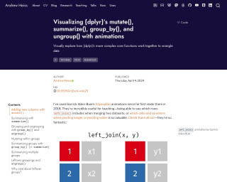
Visualizing {dplyr}’s mutate(), summarize(), group_by(), and ungroup() with animations
Andrew Heiss explores {dplyr} functions like mutate(), summarize(), group_by(), and ungroup() through handmade animations. Heiss illustrates the complexities of data manipulation workflow steps that are not immediately obvious when performing operations like adding new columns or summarizing data. This tutorial helps conceptualize the impact of these functions on data frames by visualizing their behind-the-scenes mechanics. The animations serve as an effective teaching tool to demystify what happens to data during different stages of the tidyverse's split/apply/combine paradigm, using handcrafted illustrations to make the learning process more intuitive.
Go to Resource
Vizualizing global testosterone levels by country
This article by Aspire Data Solutions outlines the process of web scraping testosterone levels for different countries from the World Population Review website and creating a choropleth map to visualize the data in R. It demonstrates how to gather, clean, and plot geographical data, cautioning that this ecological dataset is approximate, not age-standardized, and should be used for identifying patterns rather than for precise comparisons or causal inferences. The author, Mihiretu Kebede (PhD), also includes code snippets and explanations for the R packages used.
Go to Resource