
Resources
This carefully curated collection of resources will help you find packages and learning resources to help you on your R journey.
Building Stories With Data - Fixing awkward backgrounds in ggplot2
In this article, Cara Thompson shares a solution for fixing awkward backgrounds in ggplot2 when using fixed coordinate systems like coord_sf() or coord_polar(). The issue arises when the background color does not cover the entire export area. She offers several solutions, including one that she finds more elegant, involving the use of the {cowplot} package. By implementing a simple function, one can ensure the background color fills the full plotting area, enhancing the visual consistency of custom-themed graphs and maps within documents.
Go to Resource
Building Stories With Data - Optimising the use of colours for storytelling in a spaghetti plot
This article provides guidance on enhancing storytelling in spaghetti plots by optimizing color usage. It discusses data visualization challenges specific to plots with multiple overlapping trend lines, making them difficult to read. Aimed at helping a client who frequently uses these plots, it details strategies to improve clarity and convey stories more effectively. Specifically, the article focuses on altering the 'Orange' dataset in R, including adding fictitious data for illustration. It includes code snippets to modify the dataset, create plots with ggplot2, and improve interpretability by decluttering and selecting harmonious colors, inspired by Piccia Neri's painting.
Go to Resource
Burst Reporting On A Budget
Joe Kirincic introduces a cost-effective solution for burst reporting, using R to automate the creation of customized PDF reports for therapists reviewing patient treatment information. Burst reporting generates individual reports for each data subset, aiding in legal compliance and practicality. This post presents a case study on creating stylish reports with Quarto and Typst, implementing burst reporting via an R script, and improving performance with {mirai} parallelization. Intermediate knowledge of these tools is assumed, with a dataset from the {contoso} package illustrating corporate data scenarios, focusing on a sales table example.
Go to Resource
Charting 'tidycensus' data with R
This blog post by USGS Vizlab discusses how to use the 'tidycensus' R package to download and visualize U.S. Census Bureau data. It highlights visualizations such as line charts, bubble maps, cartograms, geofaceted area plots, rainfall plots, and grid charts. The post includes code examples and downloadable functions from GitHub to replicate these visualizations using data on 'households lacking plumbing' from the 2022 and 2023 ACS. It offers a practical guide for users interested in creating similar visualizations for demographic and socioeconomic data within the United States.
Go to Resource

Choropleth Map with Bar Chart in R – the R Graph Gallery
This R Graph Gallery tutorial demonstrates how to create a choropleth map combined with a bar chart in R, using ggplot2 and the patchwork package. The tutorial includes steps and code snippets for data import, manipulation, and visualization. It focuses on visualizing the Human Development Index (HDI) across subregions of Sao Paulo, Brazil. The post introduces binning of continuous variables, customizing plots, theming, and handling geospatial data with the sf package. It also walks through calculating population proportions by HDI groups. Data for the tutorial is hosted on GitHub.
Go to Resource
Cleaning Biodiversity Data in R
This content is a specialized resource for ecology and biodiversity data professionals, detailing processes for cleaning geo-referenced biodiversity data in R. Tailored specifically for ecological data, the guide goes beyond general cleaning techniques to address unique challenges in biodiversity datasets. It's freely available under a CC BY-NC-ND license, emphasizing the book's accessibility and adherence to sharing protocols. The authors acknowledge the lands and environmental know-how of Indigenous Australian peoples, showing sensitivity to cultural heritage in data practices.
Go to Resource
Code review for statisticians, data scientists & modellers – Jack Kennedy
This content provides guidance on code review practices suitable for data scientists, statisticians, and modelers, particularly those who are not primarily software developers but write code for statistical models, data-driven products, and data engineering. It covers the principles of code review, the process of annotating and commenting on code via pull requests on GitHub, and the importance of offering constructive feedback. The author aims to communicate effective code review practices to analytical professionals, with a bias towards the R language and GitHub, while asserting that the underlying concepts are pertinent regardless of specific tools used.
Go to Resource

Coloured text in {ggplot2}: {ggtext} vs {marquee}
This content compares two R packages, {ggtext} and {marquee}, which allow users to add colored text to {ggplot2} visualizations as an alternative to a traditional legend. It discusses the suitability of this approach for categorical data and provides examples using lemur data from Duke Lemar Center. The tutorial includes data wrangling with {dplyr} and creating a scatter plot in {ggplot2}, as well as describing the use of HTML and CSS for text formatting in the {ggtext} package.
Go to Resource
Computer vision with LLMs in R
The Posit blog post details the application of Computer Vision with Language Model (LLM) techniques using R. Authored by Frank Hull, a Director of Data Science & Analytics, it delves into the role of AI in the energy sector, particularly in risk understanding and uncertainty quantification. The article reflects Hull's extensive experience and introduces how Posit is enhancing data science workflows with AI. Readers are invited to subscribe for updates on Posit's latest AI integrations, features, and releases in the rapidly evolving field of data science.
Go to Resource
Constructing a Baseball Savant Graph
This content describes a workshop on creating a Baseball Savant graph and replicating its unique graphic style using Gerrit Cole's pitch data as an example. It includes a step-by-step guide on analyzing baseball data using R, from reading Retrosheet data, computing mean runs from game states, graphing expected runs, and finding leaders in total runs value. It also demonstrates how to reproduce the Movement Profile graph from Baseball Savant by manipulating and visualizing pitch movement data. The material, available on GitHub, is designed for those interested in sabermetrics and data visualization in sports analytics.
Go to Resource
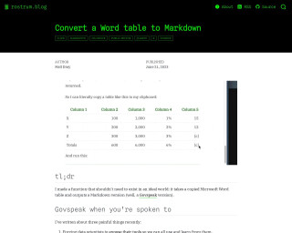
Convert a Word table to Markdown
The blog post describes a function created by the author to convert Microsoft Word tables into Govspeak Markdown, which is needed for publishing HTML files on GOV.UK. This process is typically tedious and demands attention to specific Govspeak features such as row labels and totals columns. The author introduces an R package named {wordup} that includes the function table_to_govspeak(), which handles input, guesses data types, and applies extra styles to the table conversion. It streamlines moving content from Word to Govspeak, which can be further facilitated by copying tables to the clipboard.
Go to Resource
Convierte gráficos {ggplot2} en visualizaciones interactivas con {ggiraph}
El artÃculo ofrece una guÃa paso a paso para transformar gráficos estáticos creados con {ggplot2} en visualizaciones interactivas utilizando el paquete {ggiraph} en R. Explica cómo instalar {ggiraph}, modificar funciones geométricas para la interactividad y usar girafe() para crear gráficos interactivos. Se enfoca en el uso de datos identificadores y tooltips para mejorar la interactividad y proporciona un ejemplo práctico sobre cómo adaptar un gráfico de dispersión. Además, muestra cómo personalizar estilos de tooltips con CSS, haciendo las visualizaciones más informativas y estilizadas.
Go to Resource