
Making Beautiful Tables with R
Add additional horizontal lines
This lesson is called Add additional horizontal lines, part of the Making Beautiful Tables with R course. This lesson is called Add additional horizontal lines, part of the Making Beautiful Tables with R course.
Transcript
Click on the transcript to go to that point in the video. Please note that transcripts are auto generated and may contain minor inaccuracies.
Loading transcript...
We’ve arrived at the probably the most fun lesson in this part of the course which is about theming and making the table more pretty. We’ll start by adding more lines to distinguish our summaries from the rest.
bind_rows(penguin_counts_wider, maximum_summary, total_summary) |>
  mutate(island = paste('Island: ', island)) |>
  arrange(island, year) |>
  as_grouped_data(groups = 'island') |>
  as_flextable(hide_grouplabel = TRUE) |>
  set_header_labels(
    island = 'Island',
    year = '',
    Adelie_female = 'Female',
    Adelie_male = 'Male',
    Chinstrap_female = 'Female',
    Chinstrap_male = 'Male',
    Gentoo_female = 'Female',
    Gentoo_male = 'Male'
  ) |>
  add_header_row(
    values = c('', 'Adelie', 'Chinstrap', 'Gentoo'),
    colwidths = c(1, 2, 2, 2)
  ) |>
  add_header_lines(
    values = c('Penguins in the Palmer Archipelago', 'Data is courtesy of the {palmerpenguins} R package')
  ) |>
  align(i = 3, align = 'center', part = 'header') |>
  colformat_num(i = ~ (is.na(island)), na_str = '-') |>
  align(
    i = ~ (year %in% 2007:2009),
    j = 'year',
    align = 'right'
  ) |>
  hline(i = ~ (!is.na(island) | year %in% c('2009', 'Total'))) |>
autofit()Your Turn
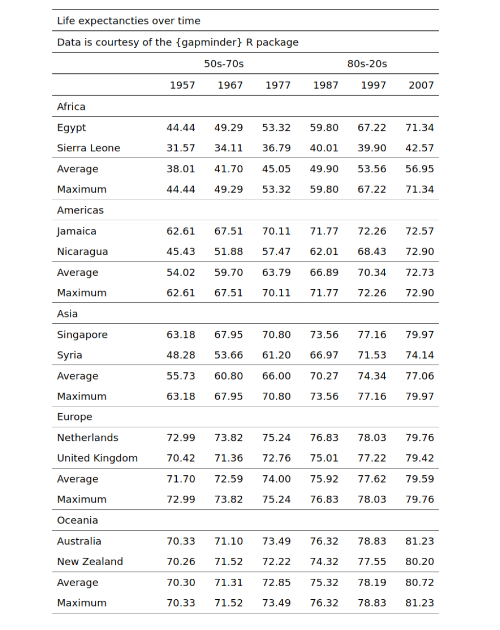
Structure your table by adding additional horizontal lines. More specifically, add horizontal lines after each continent label and before and after the block of maximum and average values. Your table should look like this:
Have any questions? Put them below and we will help you out!
Course Content
16 Lessons
You need to be signed-in to comment on this post. Login.