
Making Beautiful Tables with R
Add background colors
This lesson is called Add background colors, part of the Making Beautiful Tables with R course. This lesson is called Add background colors, part of the Making Beautiful Tables with R course.
Transcript
Click on the transcript to go to that point in the video. Please note that transcripts are auto generated and may contain minor inaccuracies.
Loading transcript...
Next, we want to bring a little bit color into our table. Right now it’s all black and white and this looks really dull.
bind_rows(penguin_counts_wider, maximum_summary, total_summary) |>
  mutate(island = paste('Island: ', island)) |>
  arrange(island, year) |>
  as_grouped_data(groups = 'island') |>
  as_flextable(hide_grouplabel = TRUE) |>
  set_header_labels(
    island = 'Island',
    year = '',
    Adelie_female = 'Female',
    Adelie_male = 'Male',
    Chinstrap_female = 'Female',
    Chinstrap_male = 'Male',
    Gentoo_female = 'Female',
    Gentoo_male = 'Male'
  ) |>
  add_header_row(
    values = c('', 'Adelie', 'Chinstrap', 'Gentoo'),
    colwidths = c(1, 2, 2, 2)
  ) |>
  add_header_lines(
    values = c('Penguins in the Palmer Archipelago', 'Data is courtesy of the {palmerpenguins} R package')
  ) |>
  align(i = 3, align = 'center', part = 'header') |>
  colformat_num(i = ~ (is.na(island)), na_str = '-') |>
  align(
    i = ~ (year %in% 2007:2009),
    j = 'year',
    align = 'right'
  ) |>
  hline(i = ~ (!is.na(island) | year %in% c('2009', 'Total'))) |>
  bg(i = 3:4, bg = 'dodgerblue4', part = 'header') |>
  bg(i = ~ (year %in% seq(2007, 2009, 2)), bg = 'grey90') |>
autofit()Your Turn
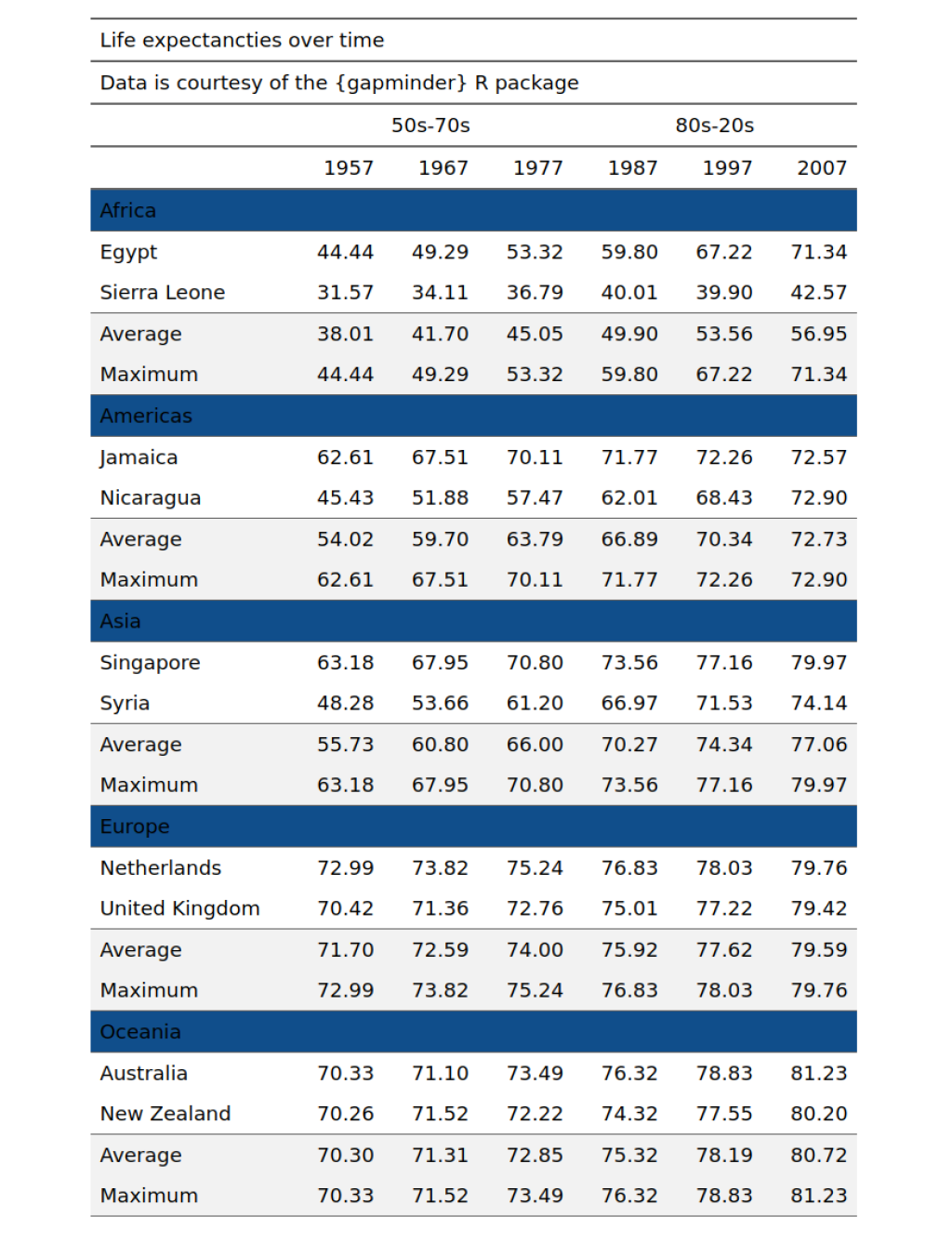
Add a nice color like e.g. "dodgerblue4" to the continent labels. And a grey-ish color like "grey95" to the average and maximum. To target the continent labels using the ~, it can be helpful to have a look at the data set that as_grouped_data() produces before it goes into as_flextable(). Your table should look like this:
Have any questions? Put them below and we will help you out!
Course Content
16 Lessons
You need to be signed-in to comment on this post. Login.