
Resources
This carefully curated collection of resources will help you find packages and learning resources to help you on your R journey.
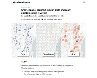
Create spatial square/hexagon grids and count points inside in R with sf | Urban Data Palette
Create spatial square/hexagon grids and count points inside in R with sf
Go to Resource
Creating typewriter-styled maps in {ggplot2} | Nicola Rennie
Creating typewriter-styled maps in ggplot2. This blog post explains the process of gathering elevation data, selecting a suitable typewriter font, and coding up a map.
Go to Resource

Data wrangling for spatial analysis: R Workshop
Data wrangling for spatial analysis: R Workshop
Go to Resource
Dr. U - Images as Facet Labels in ggplot2
This post explains how to replace the facet labels in ggplot2 with images, specifically country flags. It demonstrates how to load the required packages, obtain flag images from a GitHub repository, join the flag data with the gapminder dataset, download the flag images, generate markdown for reading the images, and create a plot with the flag images as facet labels.
Go to Resource
Exploring {ggplot2}’s Geoms and Stats
This content delves into the intricacies of geoms and stats within the {ggplot2} package's Layered Grammar of Graphics. It emphasizes the way plots are constructed by adding layers, each comprising a geom and a stat. A geom dictates the visual representation, while a stat preprocesses the data. The article explains how, for instance, geom_histogram() applies a binning stat. The exploration includes R code for listing and correlating the geoms and stats in {ggplot2}, and generating a plot to visualize the combinations. Additionally, it demonstrates data extraction post-transformation.
Go to Resource
Geocomputation with R
Geocomputation with R is a book on geographic data analysis, visualization, and modeling. It covers various topics related to working with geographic data in R.
Go to Resource
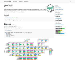
googletraffic
The 'googletraffic' package facilitates creating georeferenced traffic data using Google Maps Javascript API. It allows for the creation of rasters representing traffic conditions with pixel values indicating varying levels of traffic. The package can produce traffic data around specific points or polygons and requires a Google API key. It's useful for merging traffic data with other spatial datasets. The package includes functions for installation, configuration, and visualization of traffic rasters. Alternatives like Mapbox are mentioned, with differences in data format and coverage outlined.
Go to Resource
Hillshade effects
Dr. Dominic Royé's blog post on hillshade effects explains creating relief maps in R with shadow effects to generate visual depth. He uses several R packages, including 'sf' for vector data, 'elevatr' for elevation API access, 'terra' for raster manipulation, 'whitebox' for geospatial analysis, and 'ggplot2' extensions for scales and color blending. The tutorial covers installing packages, importing and filtering lake boundaries, and manipulating Digital Elevation Models (DEMs) for Switzerland, with reproducible R code snippets.
Go to Resource
How to fill maps with density gradients with R, {ggplot2}, and {sf} | Andrew Heiss
The blog post by Andrew Heiss explains how to address overplotting in geographic maps created with R, {ggplot2}, and {sf}. A student's project sparked the investigation into making maps more readable by filling areas with a gradient based on event count, rather than using many individual points. The post assumes familiarity with R and the {tidyverse}, and touches on various strategies for fixing overplotting, including transparency, point resizing, and density contour plotting. The author provides code examples, discusses the unique challenges of mapping, and offers solutions for visually coherent geographic data representation.
Go to Resource