
Resources
This carefully curated collection of resources will help you find packages and learning resources to help you on your R journey.
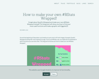
How to make your own #RStats Wrapped! | Nicola Rennie
This blog post provides a tutorial on how to create your own #RStats Wrapped, showing your most used functions and creating a graphic with ggplot2.
Go to Resource
How to Recreate this NY Times Chart in R
Spencer Schien walks through the process of recreating a professional New York Times chart using R. This type of tutorial is invaluable for learning advanced data visualization techniques by studying and replicating the work of professional data journalists with ggplot.
Go to Resource
How to use a histogram as a legend in {ggplot2}
Andrew Heiss demonstrates how to create choropleth maps in 'ggplot2' with an integrated histogram as a legend to provide additional context for the data. This approach helps to counter visual bias, such as large areas with similar colors obscuring the true distribution of data. Heiss highlights the issue using unemployment rates across U.S. counties, where larger counties can appear to have a disproportionate impact. To address this, he uses the 'ggplot2' and 'patchwork' packages in R, offering a programmatic solution as opposed to the manual process of using D3, Excel, and Figma outlined in Joey Cherdarchuk's original post.
Go to Resource
How To: Diamond Plots in R - by Owen Phillips - The F5
Owen Phillips provides a comprehensive tutorial on creating Diamond Plots in R, tailored for both casual and paid subscribers of The F5 newsletter. The tutorial emphasizes the aesthetic appeal and functional utility of Diamond Plots, which are used for visualizing NFL season data. Starting with package loading for data wrangling and plotting, the guide walks users through the process of calculating offensive and defensive EPA per play for NFL teams, data joining, and ensuring plot symmetry to effectively present the data. Owen also mentions renewing paid subscriptions and offers temporary access through coffee purchases, reinforcing the newsletter's interactive community aspect.
Go to Resource
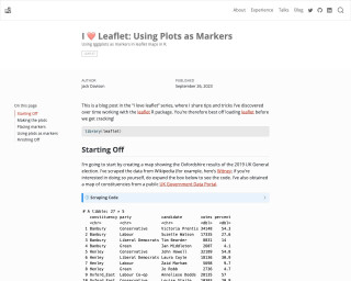
I ❤️ Leaflet: Using Plots as Markers
This blog post is part of the 'I love leaflet' series and provides tips and tricks for working with the leaflet R package. The post showcases how to create a map showing the results of the 2019 UK General election in Oxfordshire using the leaflet package.
Go to Resource
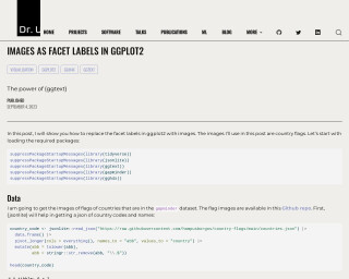
Images as Facet Labels in ggplot2
In this tutorial by Dr. U, readers learn how to use ggplot2 in conjunction with ggtext and ggh4x to replace facet labels with images, specifically country flags. After loading the necessary packages, the tutorial explains how to retrieve and preprocess country codes and names using the jsonlite package. It guides through joining the country code data with the gapminder dataset and handling missing countries. Steps to download flag images and integrate them into ggplot2 faceting are then provided. The post details creating markdown with ggtext to display images within the plot, enhancing data visualization in R.
Go to Resource
Inserted maps with ggplot2
This blog post by Dr. Dominic Royé illustrates how to create maps in R using ggplot2, with a focus on positioning outermost territories like the Canary Islands near the main map of Spain or inserting an orientation map. The tutorial includes the use of packages from the tidyverse collection and others like mapSpain and sf for handling administrative boundaries and vector data. Option 1 details shifting the Canary Islands to a common position, while Option 2 explains creating separate objects for territories without displacement for geographic accuracy.
Go to Resource
Interactive beeswarm charts in R
This content outlines the process of creating interactive beeswarm charts in R, as described by Nicola Rennie in a blog post. Beeswarm charts display distributions by allowing individual data points to be seen, preventing overlap to resemble a swarm of bees. The post details data preparation, including data wrangling steps using 'dplyr' and sorting categories for meaningful presentation. The dataset used demonstrates health by sexual orientation from the UK's LGBTQ+ census data. Additionally, it describes an initiative encouraging visualizations of LGBTQ+ data for LGBTQ+ History Month. The reader is guided through R code snippets to load, prepare, and plot the data.
Go to Resource

Interactive web-based data visualization with R, plotly, and shiny
This book provides insight and practical skills for creating interactive and dynamic web graphics for data analysis using R, plotly, and shiny.
Go to Resource
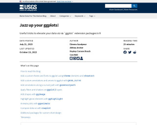
Jazz up your ggplots!
This blog post from USGS VizLab outlines various methods to customize data visualizations using ggplot2 and its extension packages in R. It discusses enhancing plots with custom themes, fonts, annotations, effects, shapes, highlights, and animations. The authors provide comprehensive code examples for each technique, encouraging reproducibility and the use of ggplot2 ecosystem rather than external design software. The blog also features a guide on how to read it effectively, including executing data-wrangling steps, installing necessary packages, and incorporating showtext for fonts.
Go to Resource