
Resources
This carefully curated collection of resources will help you find packages and learning resources to help you on your R journey.
Jazz up your ggplots! | Water Data For The Nation Blog
This blog post provides useful tricks and examples to customize ggplot2 visualizations in R using extension packages. It covers topics like adding custom themes and fonts, annotations and arrows, filters and shaders, shapes and image, highlighting elements, plot animation, chart composition, and additional packages for custom chart design.
Go to Resource
Jazz up your ggplots! | Water Data For The Nation Blog
Useful tricks to elevate your data visualization with ggplot extension packages in R.
Go to Resource

Jonathan Kitt - #TidyTuesday 2023 - Week 31
This is a tutorial on how to participate in the #TidyTuesday weekly challenge, organized by the R4DS Online Learning Community. The tutorial covers loading packages, downloading the dataset, cleaning the data, and creating visualizations.
Go to Resource
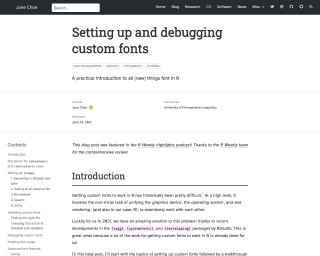
June Choe: Setting up and debugging custom fonts
This blog post provides a practical introduction to setting up and debugging custom fonts in R for data visualization using the {ragg}, {systemfonts}, and {textshaping} packages. It covers topics such as installing custom fonts, checking font availability, and advanced font features. The post also includes use-case examples and tips for using custom fonts in different R environments like RStudio, Rmarkdown, and Shiny.
Go to Resource
LA County Population Data Viz
This content outlines a detailed example of accessing and visualizing population data for Los Angeles County using R programming language. It provides insights into the population size of LA County compared to the city proper and the greater metropolitan area. Additionally, the text includes R code that interacts with the U.S. Census Bureau API, demonstrating how to retrieve, filter, and arrange population estimates with county-level granularity and geometry data for mapping. The snippet focuses on data manipulation and visualization techniques using tidyverse and tidycensus, highlighting the practical application of these tools in demographic analysis.
Go to Resource
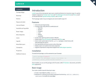
leaflet
Leaflet for R is an R package that makes it easy to integrate and control Leaflet maps in R. It provides interactive panning/zooming, the ability to compose maps using various map elements, and integration with Shiny apps. The package allows users to create maps from the R console or RStudio, embed maps in knitr/R Markdown documents and Shiny apps, and render spatial objects from the sp or sf packages. The package is widely used by websites, GIS specialists, and data visualization professionals.
Go to Resource
Listening to complex tones using sine waves and toneR
The post details an experiment with auditory perception by converting chord patterns into complex tones through programming. Matt Crump describes using the R package {toneR} to synthesize chords as sums of sine waves at varying frequencies and amplitudes, resulting in complex tonal renderings. Initial code examples involve AI model 'Dreamshaper' generating art from prompts, with a musical focus. Subsequently, the tutorial shifts to R code for audio synthesis and processing. This exploration rekindles the author's previous academic work on complex tones and their perceptual effects, inviting readers to join in the auditory experiment.
Go to Resource
Lotas - AI for RStudio | Rao Code Editor
Rao Code Editor by Lotas is an AI-powered tool designed to enhance the RStudio workflow. It offers an intelligent code editor that understands project files and data, enabling it to generate and edit code efficiently. Rao writes R scripts and R markdown files, fixes errors, and improves analyses. It also comprehensively analyzes output, including console results and data visualizations, providing suggestions and insights into the code's implications. Available with a free tier, Rao aims to streamline the coding process for RStudio users.
Go to Resource
Make simpler working with environmental data products • tidypollute
tidypollute is an R package designed to streamline the process of working with EPA AirData flat files and AQS API for environmental data analysis. Developed by Dr. Nelson Roque, the package provides tools for importing, cleaning, analyzing, and visualizing large-scale air pollution datasets. It's built with the tidyverse ethos, ensuring tidy and efficient data handling. Key features include processing EPA data files, extracting Atmotube Cloud API data, and soon to be added are real-time API queries, quick visualization tools, documentation generation, and demographic data integration.
Go to Resource
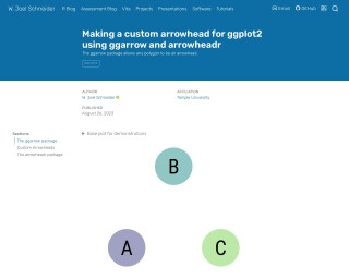
Making a custom arrowhead for ggplot2 using {ggarrow} and {arrowheadr}
This content appears to be a snippet demonstrating how to use the ggarrow package in R to create custom arrow geoms in ggplot2. It shows code examples for generating plots with different types of arrows, like open arrows, closed arrows, latex' arrows similar to TikZ, sharp barbs, feathers, kite arrowheads, and more. It includes instructions on how to adjust the arrow properties such as angle, length, sharpness, and resection. The text also compares the ggplot2 default arrows with those available in TikZ and emphasizes the flexibility provided by the ggarrow package.
Go to Resource

mapdeck
An R library for plotting large datasets on interactive maps using Mapbox GL and Deck.gl
Go to Resource
Mapping building use with a hexagonal grid
Dr. Dominic Royé demonstrates how to visualize building use distribution across Spain via a 20 km hexagonal grid. The process involves aggregating 100 m building-use rasters into hexagons, to depict land use like agricultural, industrial, and commercial purposes. Hexagons are chosen for spatial analysis to minimize directional bias and improve pattern recognition. The tutorial includes R code, using packages like terra, sf, and tidyverse, to manipulate the data and visualize the grid, with a focus on a cleaner, clutter-free presentation, and includes data from a 2023 paper for in-depth reference.
Go to Resource