
Resources
This carefully curated collection of resources will help you find packages and learning resources to help you on your R journey.
Use SAS, R, and quarto together with sasquatch
sasquatch is a package that allows the integration of SAS, R, and Quarto to create reproducible multilingual reports. The package facilitates running SAS code blocks, managing data and files across SAS and R, and rendering outputs within Quarto or R Markdown documents. It also provides functionalities for installing dependencies like Python's SASPy, configuring SAS, especially for SAS On Demand for Academics, and managing Quarto document templates for seamless integration with SAS output. Users can pass data between R and SAS, execute code blocks interactively, and render polished documents with familiar SAS styles.
Go to Resource
Visualise, Optimise, Parameterise!
This content is a workshop summary for 'Visualise, Optimise, Parameterise!' focused on data visualization with penguins dataset. Participants learn to build, enhance, and make interactive graphs using R's ggplot2 and related packages. They start with a basic plot, improve it by adding colors and themes, and finally make it interactive. The workshop emphasizes optimising plotting functions and parameterisation to meet specific requirements. It includes a recorded demo, slides, code snippets, and resources which show steps to create custom themes and interactive plots using R, demonstrating with penguins' beak lengths data visualisation.
Go to Resource
Visualize Census Data in Maps at the Block Level with R
Bastián Olea nos guÃa en cómo visualizar los recientemente lanzados datos del Censo de Población y Vivienda de Chile de 2024 en mapas a nivel de manzana. En el tutorial, aprenderemos dos métodos para mapear datos censales: utilizando mapas estáticos con el paquete {ggplot2}, y creando mapas interactivos con {mapgl}. Se inicia con la descarga de datos cartográficos desde la página del INE y se procede a cargarlos con {arrow}. Finalmente, se preparan y visualizan los datos espaciales con {dplyr} y {sf} para generar visualizaciones detalladas y útiles.
Go to Resource
Vizualizing global testosterone levels by country
This article by Aspire Data Solutions outlines the process of web scraping testosterone levels for different countries from the World Population Review website and creating a choropleth map to visualize the data in R. It demonstrates how to gather, clean, and plot geographical data, cautioning that this ecological dataset is approximate, not age-standardized, and should be used for identifying patterns rather than for precise comparisons or causal inferences. The author, Mihiretu Kebede (PhD), also includes code snippets and explanations for the R packages used.
Go to Resource
Voice control ggplot2 with ggbot2
Stephen Turner introduces ggbot2, a tool for controlling ggplot2 visualizations with voice commands. By installing ggbot2 from the tidyverse GitHub repository, users can launch a Shiny app to interact with the mtcars dataset. Voice commands enable actions like creating scatter plots, adjusting colors and sizes of points, switching themes, and reverting changes. The user-friendly ggbot2 enhances data exploration with a hands-free, efficient approach to crafting ggplot2 charts, making data visualization more accessible and interactive.
Go to Resource
W. Joel Schneider
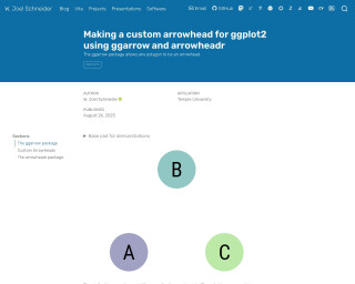
This text demonstrates the usage of arrow geometries in ggplot2 for creating custom arrowheads.
Go to Resource
Welcome to ModernDive (v2) | Statistical Inference via Data Science
ModernDive (v2) is the website for 'Statistical Inference via Data Science: A ModernDive into R and the Tidyverse (Second Edition)'. It showcases updates from the first edition, which is available online and for purchase. The book, authored by Chester Ismay, Albert Y. Kim, and Arturo Valdivia, teaches R and data science concepts. It's scheduled for print by CRC Press in 2025 and is licensed under Creative Commons. Readers can contribute on GitHub and anticipate a resource-rich approach to stats with a focus on tidyverse tools for data analysis.
Go to Resource
Where are the 4+-car households?
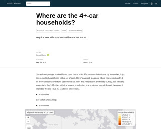
Harald Kliems investigates the prevalence of 4+-car households in the 100 most populous US cities using data from the American Community Survey. The blog post highlights the spatial distribution of such households and contrasts the top and bottom ten cities in terms of the percentage of 4+-car ownership. Key R packages used in the analysis include tidyverse, tidycensus, tigris, gt, and tmap. This examination into the facets of American car ownership is accompanied by visualizations such as maps and tables, enabling deeper insights into the data.
Go to Resource
Which names that are also names of countries are most common?
Simon P. Couch's blog post investigates which names that are also names of countries are most popular in the United States from 1880 to 2017. The post details the process of using R and packages like 'babynames' and 'countrycode' to filter and analyze baby name data. It offers a glimpse into the results, revealing the top country-names and their trends over time. Readers are encouraged to guess the most common names before seeing the data-driven answer. The post concludes with interesting visualizations showing the historical trends for the top country-names.
Go to Resource
Working with colours in R
This blog post by Nicola Rennie guides readers on effectively using colors in R for data visualization or generative art. It discusses various methods to define colors, choosing suitable color palettes, and generating custom color schemes, without delving deeply into plot implementation. A useful 'plot_palette()' function is provided with examples. Readers learn about color names, hex codes, and RGB values, and how to apply them in R, with references to further resources.
Go to Resource
xlcharts
xlcharts is an R package that serves as an interface to the OpenPyXL Python library, enabling the creation of native Excel charts within R. Aimed at overcoming the limitations of existing R packages in terms of Excel chart creation and customization, xlcharts allows users to generate Excel charts and perform advanced Excel file manipulations. Users can install xlcharts and its dependencies (Miniconda and OpenPyXL), access and edit workbook cells, and create various types of charts such as bar, bubble, and pie. It supports styles, conditional formatting, worksheet operations, pivot tables, comments, formulae, and workbook protection.
Go to Resource