
Resources
This carefully curated collection of resources will help you find packages and learning resources to help you on your R journey.
Object-Oriented Diagram Plots with ggplot2 • ggdiagram
The 'ggdiagram' package enhances the ggplot2 ecosystem by providing tools for creating object-oriented diagrams in R. Inspired by the TikZ LaTeX system, 'ggdiagram' integrates with ggplot2 through additional functions, such as 'annotate' extensions, leveraging other packages like 'ggtext', 'ggforce', and 'ggarrow'. It's not a substitute for standard ggplot2 functions but complements them for designing interrelated visual objects. Installation instructions include CRAN and R-universe options. Examples demonstrate creating and connecting geometric shapes, with the result formatted in a ggplot style suitable for data visualization and diagrammatic illustrations.
Go to Resource
Optimising VS Code and Positron for Quarto
This content presents a comprehensive guide to optimizing the editing experience of Quarto documents within VS Code and Positron platforms. It details specific editor settings adjustments aimed at improving document editing by addressing common issues such as code formatting, readability, and workspace performance. The settings enhance visual assistance, reduce visual clutter, manage markdown table rendering, and refine Git diffs. Essential configurations such as defining language-specific settings, modifying word wrapping, and utilizing bracket pair guides are discussed. Additionally, recommendations for visual line length guides, workspace performance optimization, and GitHub Copilot integration for AI assistance are provided to streamline the Quarto document editing workflow.
Go to Resource
Ordering images of toast from least toasted to most toasted...
The GitHub repository 'toast' by cj-holmes is a unique project that involves organizing images of toast based on their level of toasting, from least to most toasted. It provides an analytical approach to the humorous question of the best way to 'toast a toast' using R and ImageMagick. The repository includes code to read and analyze an image of toast, select pixel values, and visualize them to identify the level of toasting. It leverages packages from the tidyverse and uses ggplot for visualization and magick for image processing to create a greyscale intensity from RGB values of pixels.
Go to Resource
Origin and development of a Snowflake Map
This blog post describes the origin and development of a snowflake map, a data visualization technique for representing snow cover. The author explains the concept, the data used, and the steps involved in creating the map. The post also mentions the use of various packages like ggimage and magick. The final result is a snowflake hex map of the contiguous U.S. that shows average snow cover.
Go to Resource
Overriding {ggplot2} Legend Keys · Jindra Lacko
This content describes a method to achieve visual consistency in {ggplot2} legends across different plot types by overriding the legend keys. Specifically, it addresses aligning legend keys between a choropleth map and a point map in R, with the choropleth map using square keys and the point map using round points. The article provides an example using North Carolina shapefiles and demonstrates how to use the key_glyph argument in geom_sf() to customize legend glyphs, thereby maintaining a consistent legend appearance across multiple plots. It also explores alternative glyphs like timeseries and boxplot in the context of maps.
Go to Resource
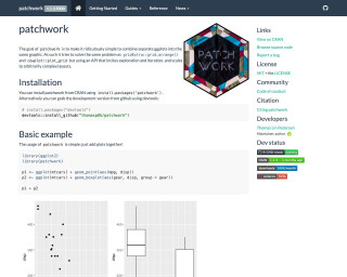
patchwork 1.3.0
patchwork 1.3.0 introduces exciting new features for creating multifigure plot compositions, adding support for beautifully formatted tables alongside figures with native support for gt objects. Enhanced by Teun Van den Brand's contributions, it allows users to seamlessly integrate tables using the wrap_elements() method or with table-specific formatting via wrap_table(). This version optimizes the space utilization of tables within plots, aligning components perfectly and providing formatting options for an improved aesthetic and functional integration of data visualizations and tabular presentations.
Go to Resource
PIPING HOT DATA: GGanimating a geographic introduction
GGanimating a geographic introduction using gganimate and ggtext
Go to Resource
Plotting Age Pyramids with ggplot
Jose M Sallan's blog post titled 'Plotting Age Pyramids with ggplot' outlines the process of creating age pyramids using R and ggplot2. Age pyramids display population distributions by age groups and sex, typically with males on the left and females on the right. The article guides readers through formatting and adjusting data using tidyverse functions, and demonstrates how to plot these pyramids by reading data from a CSV file, cleaning column names, filtering, selecting, and mutating data to reflect proper age groups and percentages. This tutorial caters to those interested in data visualization and demographic analysis.
Go to Resource
Posit AI Newsletter
Posit's blog for August 29, 2025, announces the publication of an AI newsletter curated by Sara Altman and Simon Couch, previously internal, now available biweekly. The newsletter discusses significant AI developments including environmental reports on LLMs by Mistral AI and Google, and introduces Positron Assistant and Databot for R/Python coding and data analysis. It raises awareness about the energy demands of AI during training and inference stages, emphasizes responsible AI tool usage, and shares external insights and resources on AI advancements and security vulnerabilities with the data science community.
Go to Resource