
Resources
This carefully curated collection of resources will help you find packages and learning resources to help you on your R journey.
Remove or Hide Legends in ggplot2 – Theme, Guides, Scales & Tips
This practical tutorial demonstrates how to remove or hide legends in {ggplot2} plots, covering both complete legend removal and selective legend management for plots with multiple layers. The post shows various approaches using theme settings, the guides() function, and scale modifications. It’s a handy reference for those common situations where you need fine-grained control over which legends to display, especially useful when working with complex multi-layered visualizations.
Go to Resource
resouRces
This content encompasses a comprehensive list of R-related educational materials, packages, tutorials, and datasets with projected dates ranging up to the year 2025. It includes various titles that focus on learning R programming, data analysis, data visualization, geospatial mapping, and statistical methods. Significant emphasis is placed on resources for learning R, such as introductions to R, books, courses, and video tutorials. Additionally, specific packages for data wrangling, statistical modeling, and visualization are mentioned, indicating the evolution and specialization of R's ecosystem to cater to diverse data science needs.
Go to Resource
Rotate the damn plot
Ilya Kashnitsky criticizes common academic data visualization errors, advocating for simple improvements in graph readability. He suggests using dotplots over multi-category bar/column plots, recommending the placement of continuous variables on the x-axis and categorical variables on the y-axis. Kashnitsky outlines the method to digitize the data from a plot image using WebPlotDigitizer, and expresses disappointment in mainstream Large Language Models' (LLMs) failure to automate this task accurately. He also promises to document additional dataviz principles and to enhance educational content through his BlueSky social media account.
Go to Resource
RStudio Cloud Primer: Visualize Your Data
Posit Cloud is a cloud-based platform for storing and managing business data.
Go to Resource
RStudio Cloud Primers: Visualize Data
Posit Cloud is a cloud-based solution that allows users to securely store and access their data from anywhere. It provides data storage, backup, and synchronization services, making it easy for users to access their files and collaborate with others.
Go to Resource
Saloni's guide to data visualization
Saloni Dattani of Our World in Data provides a comprehensive guide to creating effective data visualizations. While not R-specific, the principles apply directly to work in {ggplot2} and other R visualization tools. Dattani covers why visualization matters, how to choose meaningful chart types, techniques for making charts clearer (like using horizontal text and direct labeling), and how to avoid common pitfalls like misleading scales and confusing color choices. The guide emphasizes creating charts that work as standalone pieces, are accessible to colorblind viewers, and include proper context and sourcing. Whether you’re creating exploratory visualizations or polished final graphics, this guide offers valuable insights for improving your data visualization work.
Go to Resource

savonliquide
GitHub repository for the savonliquide R package, which provides a toolbox for implementing accessibility-related concepts.
Go to Resource
Short R commands and tricks
This content provides a detailed guide on embedding plots within another plot in R, and enhancing plot titles with colors to eliminate legends for maximizing real estate. The steps involve creating base and embedded plots using libraries like 'tidyverse' and 'mdthemes', and then incorporating the embedded plot with 'annotation_custom()'. It also discusses adding colored titles to plots without legends using 'ggtext' and HTML rendering. The guide includes code examples with libraries such as 'ggplot2' and 'palmerpenguins' to demonstrate the tricks in practice, making data visualization neater and more efficient.
Go to Resource
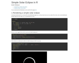
Simple Solar Eclipse in R
The tutorial 'Simple Solar Eclipse in R' by Esther Weidauer explains how to render a simple solar eclipse using R and ggplot2. It begins with generating points on a circle to simulate the moon's disk and then proceeds to add a corona effect, simulating the sun's atmosphere seen during an eclipse. Adjustments are made for a more realistic corona by creating subsets of points, assigning unique identifiers, and layering to produce the final visual effect. RMarkdown for the demo is available for download, encouraging users to try their hand at this elegant astronomical depiction.
Go to Resource
Slidecrafting
Slidecrafting is a guide by Emil Hvitfeldt on creating functional and aesthetically pleasing slides using Quarto presentations. Published on September 24, 2025, the book emphasizes the art of slidecrafting, with advice applicable to various slide technologies. It offers readers knowledge on theming, content layout, and interactivity in slides, alongside SCSS tips and extensions. The book aims to aid readers in developing their style while ensuring the constant elements of presentations are refined, suggesting the use of Quarto's reveal.js documentation for mastery.
Go to Resource
Stacked line chart
This post details how to create a polished stacked area chart in R using ggplot2, tidyverse, and additional packages. Geared toward publication, the chart features inline labels, a visually appealing color scheme, and a professional title and footer. It showcases Gilbert Fontana's work and provides a step-by-step guide starting from loading necessary libraries, like ggstream for smooth shapes and showtext for custom fonts, to loading data directly from Excel with readxl. The tutorial explains basic chart creation, smoothing lines, color scaling, custom font usage, and includes the code to produce the chart.
Go to Resource
Stacked line chart with inline labels – the R Graph Gallery
This post shows how to build a clean stacked area chart using R, ggplot2 and the tidyverse.
Go to Resource