
Resources
This carefully curated collection of resources will help you find packages and learning resources to help you on your R journey.
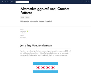
Alternative ggplot2 use: Crochet Patterns
Ryan McShane, Ph.D. demonstrates an unconventional use of ggplot2 to aid in crochet pattern design decisions. While attending a virtual statistics conference, McShane's partner works on a Chicago flag-inspired crochet baby blanket. To assist with visualizing the design, McShane employs ggplot2 to represent different pattern possibilities for the granny square arrangement, effectively combining data visualization with crafting. The article includes code snippets and detailed explanations on how to implement this creative application of ggplot2, turning a statistical tool into an artistic aid.
Go to Resource
Animated active fire maps using NASA FIRMS data in R
This video tutorial demonstrates how to create animated active fire maps using NASA's Fire Information for Resource Management System (FIRMS) data within R. Viewers will learn the techniques for importing and handling satellite-derived fire data, processing it, and then visualizing the active fire spots over time using animation tools in R. The tutorial is designed for data analysts, environmental researchers, and GIS specialists interested in mapping and geospatial analysis to monitor wildfires and understand spatial patterns using NASA's publicly available data sets in R programming environment.
Go to Resource
Apple Music Wrapped with R
Andrew Heiss demonstrates how to create an Apple Music Wrapped equivalent using R, providing a data-driven alternative for Apple Music users who lack the Spotify Wrapped feature. Heiss shares his personal preference for owning music files over streaming, utilizing iTunes/Apple Music and iTunes Match for cross-device access. The article details extracting song metadata from an XML file, which stores play counts and other information, to perform data analysis and visualization, mimicking the Spotify Wrapped experience. He criticizes the single-entry play count system but optimistically approaches creating personalized music data statistics.
Go to Resource
Applied Data Skills
The 'Applied Data Skills' book by Emily Nordmann and Lisa DeBruine is designed to teach the fundamentals of data processing and presentation using R. It guides learners through data import, cleaning, summarization, visualization, and report generation, aiming to provide skills for professional reporting and presenting. The book is part of a 10-week course with each chapter introducing new concepts and practical exercises. It emphasizes learning through practice, error resolution, and the efficient use of help resources rather than memorization. The goal is to enable learners to create automated, updateable reports and visualizations with R.
Go to Resource

Atmospheric Simulation in R
Tyler Morgan-Wall's 'Atmospheric Simulation in R' dives into the intriguing world of atmospheric models and data visualization within the R ecosystem. Part of the larger 'Rayverse' suite, this content includes extensive tutorials and package development insights for specialized R packages like Rayshader, Rayrender, Rayvertex, Rayimage, and skymodelr. It appeals to readers interested in simulating atmospheric phenomena and rendering them visually. Published in March 2026, it is a must-read for data scientists and enthusiasts keen on pushing the boundaries of 3D visualization and atmospheric simulation using R.
Go to Resource

Automate subset plots with ggplot2 and purrr
Cedric Scherer's blog post, 'Efficiency and Consistency: Automate Subset Graphics with ggplot2 and purrr,' guides readers through the process of automating the creation of subset graphics in R using the ggplot2 and purrr packages. It explains how to eliminate redundant work when generating explorative or explanatory charts for various data subsets by iterating over a vector of groups with a custom function. The post provides a practical tutorial on improving efficiency and consistency when visualizing relationships for different numeric variables, with a focus on polished charts and including examples and shortcuts for data exploration.
Go to Resource

BBC Visual and Data Journalism cookbook for R graphics
The BBC Visual and Data Journalism team has crafted an R package, complemented by a cookbook, designed to assist in generating graphics in the BBC's signature style using the ggplot2 library in R. This resource streamlines the creation of professional-looking visuals and eases the learning curve for newcomers to R. The cookbook outlines the procedures for installation and usage of the necessary R packages, including 'bbplot', which is available directly from GitHub. It includes detailed guidance on customizing plots with BBC style elements, such as text size, font, and axis formatting, through practical examples with gapminder data.
Go to Resource

bbplot
R package that helps create and export ggplot2 charts in the style used by the BBC News data team
Go to Resource
Best Practices for Data Visualisation
This content outlines best practices for creating effective and accessible data visualisations. It provides insights, advice, and code examples to enhance the readability and impact of data presentations. Emphasizing both the art and science of data visualisation, it guides readers through core principles and elements of designing charts and tables. The guide also addresses the need for authorial choices in storytelling through data and the importance of customizing default settings to convey information effectively. Aimed at Royal Statistical Society contributors, the advice is broadly applicable and includes resources for chart selection and accessibility.
Go to Resource
Bluesky conversation analysis with local and frontier LLMs with R/Tidyverse
This content details the author's exploration of bluesky conversation analysis using R and the Tidyverse suite, specifically focusing on local and frontier large language models (LLMs). The author leverages R packages atrrr, ellmer in the tidyverse, mlverse/mall, and interfaces with models such as Claude & Ollama. Processes include summarizing posts, performing sentiment analysis, and posting summaries to GitHub via the gistr R package. Techniques include data retrieval, text analysis, and summarization, showcasing how open models can provide insights into community discussions on Bluesky, particularly within the R community's use of the #Rstats hashtag.
Go to Resource
Brand your docs, apps, and ggplots using LLMs
The {{brandthis}} R package addresses the challenge of branding statistical analytics in the realm of data science by simplifying the creation of branded documents and visualizations. Developed by Umar Dani, it leverages the capabilities of large language models (LLMs) to efficiently produce branded content. The package allows users to easily specify fonts, color palettes, and custom branding themes without in-depth design knowledge. It integrates with Google Fonts and Google Gemini API, providing a streamlined process to align data visualizations with personal or company branding guidelines, using an interactive interface for crafting brand files and enhancing ggplot2 visualizations.
Go to Resource