
Resources
This carefully curated collection of resources will help you find packages and learning resources to help you on your R journey.
Efficiency and Consistency: Automate Subset Graphics with ggplot2 and purrr - Cédric Scherer
Efficiency and Consistency: Automate Subset Graphics with ggplot2 and purrr is a blog post by Cédric Scherer that discusses automated plot generation with ggplot2. The post explains how to create a set of explorative or explanatory charts for different variables or categories of a dataset using a functional programming approach. It provides examples and tips for working with variables and explores data sets visually.
Go to Resource
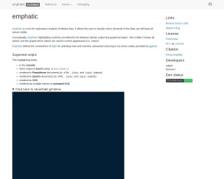
emphatic
emphatic is a package for R that enriches exploratory analysis of tabular data by allowing users to add visual color highlights. It bridges the gap between tabular and graphical output, displaying data values that control appearance, such as color, while still showing all values. Compatible with dplyr row and column selection, it also integrates with ggplot2's color scales. Outputs include console, Excel, Rmarkdown, Quarto, SVG, and animated SVG rendering. Features include data frame highlighting, difference highlighting between objects, regex matching, and conversion to HTML, SVG, or Excel. Installation via GitHub is straightforward.
Go to Resource
Exploring {ggplot2}’s Geoms and Stats
This content delves into the intricacies of geoms and stats within the {ggplot2} package's Layered Grammar of Graphics. It emphasizes the way plots are constructed by adding layers, each comprising a geom and a stat. A geom dictates the visual representation, while a stat preprocesses the data. The article explains how, for instance, geom_histogram() applies a binning stat. The exploration includes R code for listing and correlating the geoms and stats in {ggplot2}, and generating a plot to visualize the combinations. Additionally, it demonstrates data extraction post-transformation.
Go to Resource

Fix labels and understand scale functions in ggplot - YouTube
This YouTube video provides an explanation of how to fix labels and understand scale functions in ggplot.
Go to Resource
Flowcharts made easy with the package {flowchart}
The {flowchart} package in R facilitates the creation of flowcharts, particularly useful in health research to show participant flow in studies. It integrates with the tidyverse workflow, offering customizable functions that work with pipe operators. Unlike other packages, it adapts flowcharts automatically to the data, enhancing reproducibility. The post explains installation, initialization, and drawing processes using the SAFO clinical trial dataset. It's easy to produce complex flowcharts without manual parameter setting thanks to the package's tidyverse-centric design.
Go to Resource
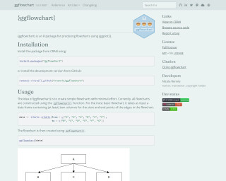
Flowcharts with ggplot2 • ggflowchart
The {ggflowchart} package for R is a specialized tool designed to create flowcharts using the {ggplot2} framework with simplicity and minimal effort. You can install either the stable CRAN release or the development version from GitHub. Users can generate basic flowcharts by defining start and end points of edges within a data frame, and then invoking the ggflowchart() function. Additional customization is possible through aesthetic mappings such as fill, text color, and future updates may introduce further options. The package also encourages contributions, setting guidelines for pull requests including passing checks and following best practices in development.
Go to Resource
Formatted Spreadsheets to gts • forgts
The forgts package provides a way to convert spreadsheets into gt tables while preserving cell and text formatting from the original file. It supports a variety of format attributes, including font styles, cell fills, and borders, but intentionally ignores header formatting. This tool iterates over the gt defaults to apply necessary styling. Useful in data reporting and visualization, forgts allows easy installation from GitHub and seamless integration with RMarkdown and Quarto, completed by exporting functionalities with gt::gtsave(). It facilitates creating visually consistent tables for analysis and presentation within the R ecosystem.
Go to Resource
Generating quarto syntax within R – Notes from a data witch
This blog post introduces 'quartose', an R package designed to integrate with Quarto for literate programming. The author, located in Sydney, discusses the nuances of names and their personal connection to this topic before exploring a data analysis task using the 'babynames' package. The analysis involves mapping names to data frames and visualizing name popularity over time. The post concludes with a demonstration of 'quarto_tabset()' that allows inserting plots or data frames into a document as a tabbed interface, enhancing the presentation of data in a readable and interactive format.
Go to Resource
Getting fonts to work in R
Getting fonts to work in R and RStudio can be tricky! This post walks through the different steps we need to follow to give ourselves the best chance of success.
Go to Resource