
Resources
This carefully curated collection of resources will help you find packages and learning resources to help you on your R journey.
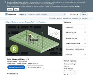
Build Advanced Charts in R
The LinkedIn Learning course 'Build Advanced Charts in R' by Rita Giordano is an advanced-level data visualization course. Over 1 hour and 43 minutes, students delve into creating sophisticated charts including lollipop plots, sparklines, dot charts, and slope charts. The course covers creating theme functions, combining plots, and ensuring accessibility with colorblind-friendly palettes and dyslexia-friendly fonts. Participants will learn when to use advanced charts, how to apply accessibility principles, and how to build a simple infographic. A downloadable certificate of completion enhances professional profiles, demonstrating data visualization proficiency in R.
Go to Resource
Build Advanced Charts in R Online Class | LinkedIn Learning, formerly Lynda.com
This online class on LinkedIn Learning (formerly Lynda.com) teaches users how to build advanced charts in R for data visualization. The course covers topics such as lollipop plots, sparklines, dot charts, slope charts, and chord diagrams. It also includes information on creating a theme function, combining multiple plots, and addressing accessibility and annotations. The instructor, Rita Giordano, is a data visualization consultant and LinkedIn Instructor.
Go to Resource
Building a Linkedin data visualisation template with Quarto and Typst
Aaron Schiff shares a method for sharing data visualizations on Linkedin using Quarto and Typst. He created a template that allows for the production of nicely formatted PDFs to circumvent Linkedin's subpar image handling. The template includes a topic heading, summary text, a ggplot chart, data source citation, optional two-column text, and a footer. Additionally, Schiff explains the synergy of Quarto, a publishing system, and Typst, a layout framework, to streamline the production of visually appealing PDFs. He provides guidance on creating a Quarto Typst template and how to use it with example code and the configuration process.
Go to Resource
Building Stories With Data - Fixing awkward backgrounds in ggplot2
In this article, Cara Thompson shares a solution for fixing awkward backgrounds in ggplot2 when using fixed coordinate systems like coord_sf() or coord_polar(). The issue arises when the background color does not cover the entire export area. She offers several solutions, including one that she finds more elegant, involving the use of the {cowplot} package. By implementing a simple function, one can ensure the background color fills the full plotting area, enhancing the visual consistency of custom-themed graphs and maps within documents.
Go to Resource
Building Stories With Data - Optimising the use of colours for storytelling in a spaghetti plot
This article provides guidance on enhancing storytelling in spaghetti plots by optimizing color usage. It discusses data visualization challenges specific to plots with multiple overlapping trend lines, making them difficult to read. Aimed at helping a client who frequently uses these plots, it details strategies to improve clarity and convey stories more effectively. Specifically, the article focuses on altering the 'Orange' dataset in R, including adding fictitious data for illustration. It includes code snippets to modify the dataset, create plots with ggplot2, and improve interpretability by decluttering and selecting harmonious colors, inspired by Piccia Neri's painting.
Go to Resource
Calculating and Analyzing Measures of Deprivation in the United States with deprivateR
deprivateR is an R package designed to provide a unified API for calculating and accessing various socioeconomic deprivation indices in the United States, such as the Area Deprivation Index (ADI), Neighborhood Deprivation Index (NDI), and Social Vulnerability Index (SVI), along with the Gini Coefficient. It offers a straightforward interface to compare indices across years and geographies, useful in research and public health. Though valuable, users should note some indices have limited validation for certain Census geographies. The package is available on CRAN and GitHub for easy installation and includes core functions like dep_get_index() and dep_calc_index() for computing deprivation scores using data like the American Community Survey.
Go to Resource
Charting 'tidycensus' data with R
This blog post by USGS Vizlab discusses how to use the 'tidycensus' R package to download and visualize U.S. Census Bureau data. It highlights visualizations such as line charts, bubble maps, cartograms, geofaceted area plots, rainfall plots, and grid charts. The post includes code examples and downloadable functions from GitHub to replicate these visualizations using data on 'households lacking plumbing' from the 2022 and 2023 ACS. It offers a practical guide for users interested in creating similar visualizations for demographic and socioeconomic data within the United States.
Go to Resource

Choropleth Map with Bar Chart in R – the R Graph Gallery
This R Graph Gallery tutorial demonstrates how to create a choropleth map combined with a bar chart in R, using ggplot2 and the patchwork package. The tutorial includes steps and code snippets for data import, manipulation, and visualization. It focuses on visualizing the Human Development Index (HDI) across subregions of Sao Paulo, Brazil. The post introduces binning of continuous variables, customizing plots, theming, and handling geospatial data with the sf package. It also walks through calculating population proportions by HDI groups. Data for the tutorial is hosted on GitHub.
Go to Resource


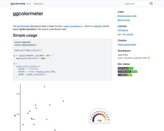
Colormeter Guide Extension • ggcolormeter
The ggcolormeter package provides a single function guide_colormeter() which is a ggplot2 color/fill legend guide extension in the style of a dashboard meter.
Go to Resource
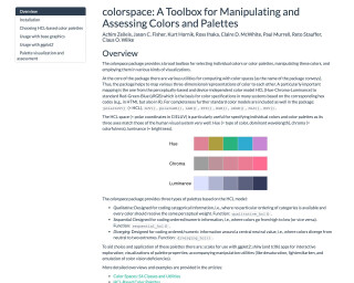
colorspace: A Toolbox for Manipulating and Assessing Colors and Palettes
colorspace is a toolbox for manipulating and assessing colors and palettes in the R language. It provides utilities for computing with color spaces, such as converting between different color models. The package also includes predefined color palettes and functions for creating customized palettes. It can be used for visualizations and choosing colors in data analysis and graphic design.
Go to Resource