
Resources
This carefully curated collection of resources will help you find packages and learning resources to help you on your R journey.
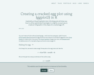
Creating a cracked egg plot using {ggplot2} in R | Nicola Rennie
Creating a cracked egg plot using {ggplot2} in R
Go to Resource
Creating Effective Display Tables with the gt Package
This content is a comprehensive guide titled 'Creating Effective Display Tables with the gt Package' by Richard Iannone. It introduces readers to building professional tables using the gt package in R. The book starts with basic table creation and progresses to advanced customization, with a focus on clarity, design, and functionality. It offers an intuitive, incremental approach to table building, with detailed instructions on formatting, layouts, and customization options for various output formats. Designed for a range of R users, the resource is both a tutorial and reference, containing reproducible examples, full code, and documented datasets for practical learning.
Go to Resource

Creating interactive visualizations with {ggiraph} (with or without Shiny)
Albert Rapp's blog post explains how to create interactive visualizations using the {ggiraph} package with or without Shiny in the R programming environment. It guides readers through the process of turning a ggplot into an interactive plot where users can focus on details that interest them. The tutorial includes data preparation with 'dplyr' and 'ggplot2', and demonstrates how to add interactivity to both lines and points in a chart. The post covers the use of 'geom_point_interactive', 'geom_line_interactive', and 'girafe()' function for rendering, and customization options for hover effects and plot sizing.
Go to Resource
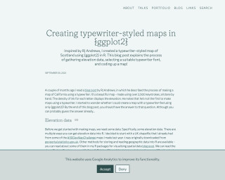
Creating typewriter-styled maps in {ggplot2}
This blog post by Nicola Rennie details how to create a typewriter-styled map of Scotland using the {ggplot2} package in R. The process involves gathering elevation data from a shapefile and using the {elevatr} package for accessing the elevation API. Selecting a suitable typewriter font with {sysfonts} and {showtext}, Rennie demonstrates how to represent different elevation levels with various letters in a monospace font. The final output replicates the appearance of a map created with a typewriter, reminiscent of RJ Andrews' handcrafted map of California using over 2,500 keystrokes.
Go to Resource
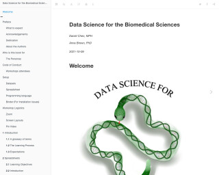
Data Science for the Biomedical Sciences
Data Science for the Biomedical Sciences is a book that provides an introduction to data science concepts and tools specifically tailored for the biomedical sciences. It covers topics such as spreadsheets, R and RStudio, data loading, descriptive calculations, data cleaning, visualization, analysis, working with multiple datasets, APIs, functions, survival analysis, machine learning, and more.
Go to Resource
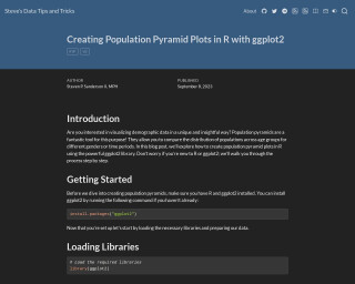
Data Tips and Tricks - Creating Population Pyramid Plots in R with ggplot2
In this tutorial, Steve guides us through creating population pyramid plots in R using the ggplot2 library. Ideal for visualizing demographic data, these plots compare population distribution across age groups and genders or different time periods. The post includes a step-by-step guide, beginning with installing ggplot2, to loading libraries and preparing data. It covers generating a basic bar chart for one gender and extending it to combine both genders, thereby constructing the desired population pyramid plot. Readers will learn how to manipulate plot aesthetics for visual clarity and symmetry in demographic presentations.
Go to Resource
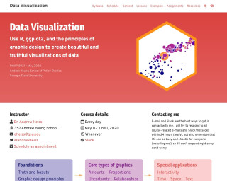
Data Visualization
Use R, ggplot2, and the principles of graphic design to create beautiful and truthful visualizations of data
Go to Resource
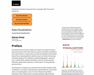
Data Visualization: A Practical Introduction
Data Visualization: A Practical Introduction, due for release in March 2026 from Princeton University Press, is a comprehensive guide that teaches the principles and methods necessary for effectively visualizing data. With a focus on R and ggplot2, the second edition incorporates significant updates, including the use of base R's pipe operator. The book aims to enable readers to reproduce the figures within and understand the underlying principles, bridging the gap between high-level concepts and practical implementation with graphical tools.
Go to Resource
Data Visualization: A Practical Introduction
This is a book about data visualization using R and ggplot. It covers various topics such as working with plain text, making plots, showing the right numbers, graphing tables, working with models, and drawing maps.
Go to Resource
Dr. U - Images as Facet Labels in ggplot2
This post explains how to replace the facet labels in ggplot2 with images, specifically country flags. It demonstrates how to load the required packages, obtain flag images from a GitHub repository, join the flag data with the gapminder dataset, download the flag images, generate markdown for reading the images, and create a plot with the flag images as facet labels.
Go to Resource
Drawing Anything with ggplot2
Material for the 'Drawing Anything with ggplot2' workshop by thomasp85
Go to Resource
Easily Arrange External Figures with Patchwork Alongside ggplot2 Figures • figpatch
Easily Arrange External Figures with Patchwork Alongside ggplot2
Go to Resource