
Resources
This carefully curated collection of resources will help you find packages and learning resources to help you on your R journey.

Coloured text in {ggplot2}: {ggtext} vs {marquee}
This content compares two R packages, {ggtext} and {marquee}, which allow users to add colored text to {ggplot2} visualizations as an alternative to a traditional legend. It discusses the suitability of this approach for categorical data and provides examples using lemur data from Duke Lemar Center. The tutorial includes data wrangling with {dplyr} and creating a scatter plot in {ggplot2}, as well as describing the use of HTML and CSS for text formatting in the {ggtext} package.
Go to Resource
Compute and Visualize Wildfire Exposure • fireexposuR
fireexposuR is an R package designed for computing and visualizing wildfire exposure with a focus on aiding wildfire management. It automates established methodologies, offers customization for various use cases and geographies, and enables output visualization. Users from varied sectors like research, government, and forestry can benefit, but a solid understanding of wildland fuels, spatial data, and R is recommended. The package ensures accessibility and encourages users to familiarize themselves with the underpinning scientific theories for effective use. It doesn't simplify the complexities of theory, data preparation, or parameter decision-making intrinsic to wildfire exposure assessments.
Go to Resource
Computer vision with LLMs in R
The Posit blog post details the application of Computer Vision with Language Model (LLM) techniques using R. Authored by Frank Hull, a Director of Data Science & Analytics, it delves into the role of AI in the energy sector, particularly in risk understanding and uncertainty quantification. The article reflects Hull's extensive experience and introduces how Posit is enhancing data science workflows with AI. Readers are invited to subscribe for updates on Posit's latest AI integrations, features, and releases in the rapidly evolving field of data science.
Go to Resource
Constructing a Baseball Savant Graph
This content describes a workshop on creating a Baseball Savant graph and replicating its unique graphic style using Gerrit Cole's pitch data as an example. It includes a step-by-step guide on analyzing baseball data using R, from reading Retrosheet data, computing mean runs from game states, graphing expected runs, and finding leaders in total runs value. It also demonstrates how to reproduce the Movement Profile graph from Baseball Savant by manipulating and visualizing pitch movement data. The material, available on GitHub, is designed for those interested in sabermetrics and data visualization in sports analytics.
Go to Resource
Convierte gráficos {ggplot2} en visualizaciones interactivas con {ggiraph}
El artÃculo ofrece una guÃa paso a paso para transformar gráficos estáticos creados con {ggplot2} en visualizaciones interactivas utilizando el paquete {ggiraph} en R. Explica cómo instalar {ggiraph}, modificar funciones geométricas para la interactividad y usar girafe() para crear gráficos interactivos. Se enfoca en el uso de datos identificadores y tooltips para mejorar la interactividad y proporciona un ejemplo práctico sobre cómo adaptar un gráfico de dispersión. Además, muestra cómo personalizar estilos de tooltips con CSS, haciendo las visualizaciones más informativas y estilizadas.
Go to Resource
cowplot
The cowplot package provides various features that help with creating publication-quality figures, such as a set of themes, functions to align plots and arrange them into complex compound figures, and functions that make it easy to annotate plots and or mix plots with images.
Go to Resource
CRAN - Package ggquiver
An extension of 'ggplot2' to provide quiver plots to visualise vector fields.
Go to Resource
Create custom GPS route maps in R
This content is a tutorial by Nicola Rennie, published on November 23, 2025, about creating custom GPS route maps in R. It provides a step-by-step guide on how to use spatial data to produce printable maps, ideal for runners, cyclists, or anyone interested in learning about spatial data handling in R. The tutorial includes loading GPS data from files (such as .gpx), processing it using R packages like 'gpx', 'tidyverse', and 'sf', and then enhancing the maps with background data from OpenStreetMap through the 'osmdata' package.
Go to Resource
Create Interactive Gantt Charts with Work Breakdown Structure • ganttify
Ganttify is a package that allows for the creation of interactive Primavera-style Gantt charts with a Work Breakdown Structure (WBS) hierarchy. Leveraging plotly, the package enables flexible and dynamic visualizations with features such as multi-level WBS organization, flexible coloring, interactive elements, dynamic date formatting, scrollable views, milestone lines, and options for dimming past activities. Users can show/hide WBS, customize labels, and compare planned vs actual dates. It offers an organized configuration API for cleaner code and is available on CRAN and GitHub.
Go to Resource
Create Music with R
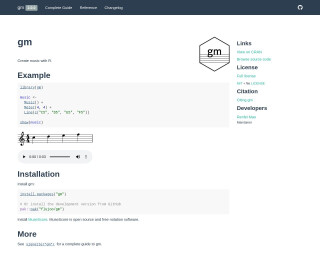
The 'gm' package in R enables users to create music by programmatically defining musical elements such as meter and musical lines. It offers an ease of composing music within R. Using functions like 'Music()', 'Meter()', and 'Line()', users can construct and visualize melodies. The package is easily installable from CRAN or GitHub for the development version. Integration with MuseScore, a free notation software, allows for a seamless music notation experience. The 'gm' package is open-source under the MIT license, with detailed documentation available in its vignette.
Go to Resource
Create paint by numbers images
The 'paintr' GitHub repository hosts an R package for creating paint-by-numbers images. It leverages the 'magick' package for image processing and color picking, and 'sf' and 'rmapshaper' packages for handling image polygons. Users can apply noise reduction, smoothing, and polygon simplification to adjust the image feel. It also allows for custom color palettes. The repository contains examples, including usage with Hadley Wickham's photo, demonstrating how to generate a paint-by-numbers result and apply different palettes for the desired artistic effect.
Go to Resource
Create Sankey and Alluvial Diagrams Using ggplot2 • ggsankeyfier
The ggsankeyfier package enhances ggplot2 by allowing the creation of Sankey and Alluvial diagrams, which are types of data visualization that depict the flow of quantities through stages or categories. It provides specialized functions to handle the complex layout of these diagrams, including the ability to model skipped stages or feedback loops. The package defines its own terms for consistency and offers a thesaurus for commonly used Sankey terminology. It can be installed from CRAN or GitHub and is integrated into the ggplot2 workflow, requiring structured data for plotting.
Go to Resource