
Resources
This carefully curated collection of resources will help you find packages and learning resources to help you on your R journey.
{datapasta} came up at #CascadiaRconf
Libby Heeren highlights the {datapasta} R package, particularly useful for copying tables from various sources and pasting them into R as a tibble or other data structures. She praises the package's efficiency and its contribution to reproducibility in data handling. The community shares positive feedback, with many expressing a desire to use the package for its convenience and reproducibility benefits. An updated version is recommended from GitHub, as the CRAN version is not the latest. The post indicates a strong appreciation for {datapasta} within the R community.
Go to Resource

{ggborderline}
The ggborderline package enhances ggplot2 line plots with geoms that add an outlined effect, improving clarity for plots with overlapping lines. It's ideal for visualizing 'worm' style data. Users can replace ggplot2 line geoms with border equivalents to achieve a white outline where lines intersect, with settings for borderwidth and bordercolour these subtle enhancements can be adjusted. Additionally, the package makes the borders visible in the plot's legend. Installation instructions include CRAN and GitHub options, inspired by a need to avoid indistinct lines in complex visualizations, offering an aesthetic alternative to ggplot2's capabilities.
Go to Resource
{legendry}
The 'legendry' package is a new ggplot2 extension for improving guide options in R plots, now available on CRAN. It provides tools for flexible and reproducible placement of annotations within figures, avoiding the need for post-editing in external software. Originating from the author's earlier work on 'ggh4x', 'legendry' enhances guides in ggplot2 by using the ggproto system. The package includes vignettes and aims to simplify the customization of scale guides. With 'legendry', users can introduce manual keys and complete guides, such as 'guide_axis_nested' for ranges or 'guide_legend_groups' for groups, thereby expanding visualization capabilities.
Go to Resource

A ggplot2 Tutorial for Beautiful Plotting in R
A ggplot2 tutorial for beautiful plotting in R by Cédric Scherer
Go to Resource
A SIMPLE guide to create BUMP CHARTS with ggplot2 - YouTube
A YouTube tutorial on creating bump charts with ggplot2
Go to Resource
A year with Visible Long-Covid Tracking
Dr. Mowinckel shares insights on a year-long journey of tracking Long Covid symptoms using the Visible app. The app monitors heart rate, HRV, daily symptoms, and functional capacity through the FUNCAP27 questionnaire. The post details the process of collecting and analyzing personal health data to understand recovery patterns, pacing strategies, and warning signs. The blog also offers a look at tools within Visible that help visualize progress, such as heart rate graphs and a functional capacity semi-circle, providing a valuable resource for individuals managing Long Covid.
Go to Resource
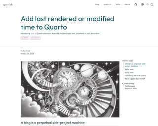
Add last rendered or modified time to Quarto
Garrick Aden-Buie's blog post introduces 'now,' a Quarto extension that allows the automatic update of time information in Quarto documents. This extension saves time by eliminating the need for manual updates of dates in documentation footers. By adding the extension using 'quarto add gadenbuie/quarto-now,' Quarto users can employ shortcodes like '{{< now >}}' and '{{< modified >}}' to display the current or last modified time. The extension supports customization of time output formats and may significantly streamline Quarto project maintenance by ensuring date accuracy without manual intervention.
Go to Resource
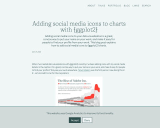
Adding social media icons to charts with {ggplot2}
Adding social media icons to charts with {ggplot2}
Go to Resource
Age Disparity in Shelter Cost per Room
This content details a study on shelter cost per room over time in various regions and age groups in Canada, using Census data as a proxy for housing size. The authors, von Bergmann and Lauster, investigate the increasing shelter costs, particularly for younger people and in areas with housing shortages. They compare these costs with UK statistics on shelter cost per square meter by age and explore the limitations and benefits of using the number of rooms as a metric for household space and costs. The analysis includes data-wrangling using tidyverse and custom functions in R.
Go to Resource
AI capabilities built into Positron
Recorded at posit::conf(2025), this demo showcases practical ways to use the Positron Assistant for tasks like debugging code, generating visualizations, and even creating entire Quarto reports. It also introduces Databot, an experimental agent for exploratory data analysis, demonstrating how these tools can accelerate your workflow while keeping you in the driver’s seat.information, advertising opportunities, and terms of service. It also includes a nod to privacy and safety principles and the operational workings of YouTube. Additionally, it promotes YouTube's experimentation with new features and the service NFL Sunday Ticket. The 2025 copyright date suggests forward-looking engagement with these matters. The content outlines multiple facets of YouTube's online presence and user interface.
Go to Resource
Albert Rapp - Creating interactive visualizations with {ggiraph} (with or without Shiny)
Creating interactive visualizations with ggiraph (with or without Shiny)
Go to Resource

Albert Rapp - Four reasons to learn HTML + CSS as an R programmer
Four reasons to learn HTML + CSS as an R programmer
Go to Resource