
Resources
This carefully curated collection of resources will help you find packages and learning resources to help you on your R journey.
How To: Diamond Plots in R - by Owen Phillips - The F5
Owen Phillips provides a comprehensive tutorial on creating Diamond Plots in R, tailored for both casual and paid subscribers of The F5 newsletter. The tutorial emphasizes the aesthetic appeal and functional utility of Diamond Plots, which are used for visualizing NFL season data. Starting with package loading for data wrangling and plotting, the guide walks users through the process of calculating offensive and defensive EPA per play for NFL teams, data joining, and ensuring plot symmetry to effectively present the data. Owen also mentions renewing paid subscriptions and offers temporary access through coffee purchases, reinforcing the newsletter's interactive community aspect.
Go to Resource
I ❤️ Leaflet: Using Plots as Markers
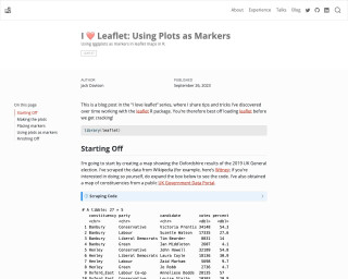
This blog post is part of the 'I love leaflet' series and provides tips and tricks for working with the leaflet R package. The post showcases how to create a map showing the results of the 2019 UK General election in Oxfordshire using the leaflet package.
Go to Resource
I Made R Text For Me
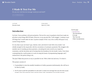
Brenden Smith shares his experience tackling procrastination in his personal life by using R to automate monthly utility bill calculations and notifications for his roommates. He created an R script connected to a Google Sheets spreadsheet to automatically handle and split the bills, and even set up cron jobs to ensure the process runs without his intervention. His project shows how programming can be applied to simplify and optimize mundane tasks, turning them into efficient, automated systems.
Go to Resource
I Vibe Coded an R Package
Jonathan Carroll documents his journey of creating an R package to visualize similar kanji characters. After starting to learn Japanese with his daughter, he couldn't find an existing solution to visually compare kanji characters for his studies. Utilizing Claude Code, Carroll developed a package in just $20 and one afternoon, complete with full documentation, mocked tests, API coverage, caching, and graph visualizations. The resulting network diagram displays kanji with similarities, aiding memory and recognition. This personal project showcases an efficient approach to language learning tool development in R.
Go to Resource
I wrote this talk with an LLM
In this keynote presentation from useR! 2025, Hadley Wickham explores how AI can augment rather than replace data science workflows. As the Chief Scientist at Posit and creator of the tidyverse, Wickham shares insights on the evolving relationship between humans and AI in data analysis. The talk demonstrates practical ways that large language models can enhance productivity while maintaining the critical thinking and domain expertise that data scientists bring to their work.
Go to Resource
Images as Facet Labels in ggplot2
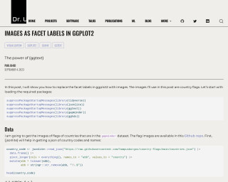
In this tutorial by Dr. U, readers learn how to use ggplot2 in conjunction with ggtext and ggh4x to replace facet labels with images, specifically country flags. After loading the necessary packages, the tutorial explains how to retrieve and preprocess country codes and names using the jsonlite package. It guides through joining the country code data with the gapminder dataset and handling missing countries. Steps to download flag images and integrate them into ggplot2 faceting are then provided. The post details creating markdown with ggtext to display images within the plot, enhancing data visualization in R.
Go to Resource
Inserted maps with ggplot2
This blog post by Dr. Dominic Royé illustrates how to create maps in R using ggplot2, with a focus on positioning outermost territories like the Canary Islands near the main map of Spain or inserting an orientation map. The tutorial includes the use of packages from the tidyverse collection and others like mapSpain and sf for handling administrative boundaries and vector data. Option 1 details shifting the Canary Islands to a common position, while Option 2 explains creating separate objects for territories without displacement for geographic accuracy.
Go to Resource
Interactive beeswarm charts in R
This content outlines the process of creating interactive beeswarm charts in R, as described by Nicola Rennie in a blog post. Beeswarm charts display distributions by allowing individual data points to be seen, preventing overlap to resemble a swarm of bees. The post details data preparation, including data wrangling steps using 'dplyr' and sorting categories for meaningful presentation. The dataset used demonstrates health by sexual orientation from the UK's LGBTQ+ census data. Additionally, it describes an initiative encouraging visualizations of LGBTQ+ data for LGBTQ+ History Month. The reader is guided through R code snippets to load, prepare, and plot the data.
Go to Resource

Interactive web-based data visualization with R, plotly, and shiny
This book provides insight and practical skills for creating interactive and dynamic web graphics for data analysis using R, plotly, and shiny.
Go to Resource
Introducing Databot: An AI assistant for exploratory data analysis
Databot is an AI-powered assistant developed by Posit to augment the exploratory data analysis (EDA) capabilities of data scientists who use Python or R. This ambitious application of large language models (LLMs) aims to fast-track the EDA process, which conventionally takes hours, down to just minutes. Unlike autonomous or sandbox-constrained AI agents, Databot works interactively in a highly collaborative 'pair programming' style, engaging the user with rapid code-writing, execution, and analysis. It employs a cycle termed the 'WEAR loop' to ensure insights are reliable, serendipitous, and transparent. Databot remains a research preview exclusively available for Positron users.
Go to Resource
Introducing Posit AI
Simon P. Couch announces the release of Posit AI, a new AI service for data scientists, which comprises Posit Assistant and Next Edit Suggestions. Posit Assistant acts as a data science and coding agent, combining aspects of Claude Code with Databot, offering users a sophisticated coding experience. Next Edit Suggestions provide advanced autocomplete capabilities and are initially available in RStudio, with plans to extend to other platforms. Simon highlights the effort put into making Posit AI practical for everyday use and mentions the upcoming detailed post about the Next Edit Suggestions system.
Go to Resource